Get a personalized assessment of your operational efficiency and accelerate growth for your business.
Whether you have built an e-commerce app or a healthcare website, prioritizing design accessibility is crucial.
An accessible design makes sure your site is usable by everyone - including people with disabilities.
Accessibility matters. Here’s what the stats say.
According to the CDC, 26% of American adults live with some form of disability.
75% of American people with disabilities say they use the internet daily.
However, in another study of the home pages for the top 1,000,000 websites, more than 51 million distinct accessibility errors were detected. Now, this is an average of 51.4 errors per page.
The solution here lies in accommodating more people by creating inclusive websites and applications.
In this article, let's discuss what accessibility is and why you should make your websites accessible. We’ll also discuss best practices for improving the accessibility of your site.
Let’s get started!
What is Accessibility?
Accessibility is the way of making your website and app easy to use for people with disabilities.
Simply put, just as some people need mobility scooters, wheelchair ramps, or braille signs to navigate physical spaces, web accessibility ensures people with disabilities can navigate through websites/apps easily.
From a design perspective, accessibility involves designing application interfaces for people with different types of disabilities, such as vision, hearing, cognitive, etc.
Accessibility brings immense benefits to everyone. Accessibility features, meant to help people with disabilities, are often considered useful by others.
For example, including video captions not only helps people with hearing challenges, it also helps someone who is watching the video on mute (just as in the case of the social media feed).
Or, including legible, high-contrast fonts that help people with vision disabilities. But it also allows people with perfect eyesight who may be using the app outdoors in bright sunlight.
Whatever the kind of disability, empathy is essential for creating an accessible design.
Why Should We Care About Accessibility in Design
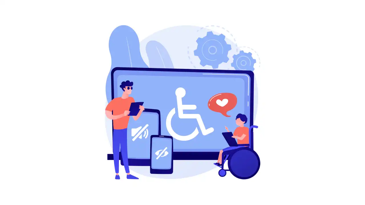
Equal access sounds nice, but most of us don't understand why web accessibility is essential. In fact, we think of it as an additional headache that can cost us dollars.
But let me share a secret here.
This is just not true. On the contrary, not caring about accessibility can turn out to be expensive.
Here are the reasons why.
1. Legal Complications
Many countries across the globe have made it mandatory for websites and applications to meet accessibility requirements before going live. Accessibility testing, therefore, should be done to meet all legal compliance.
Accessibility requirements in the USA are listed in the ADA (Americans with Disabilities Act). This law was passed in 1990. Back then, it was mainly concerned with physical stores. However, with 800-plus lawsuits filed in 2017 alone, businesses started understanding the reality of the threat of litigation in case of inaccessible digital content.
As per the ADA, any business whose content is deemed inaccessible to a person with a disability can be asked to redesign its website and pay monetary damages.
For example, in 2008, Target Corp., the retail giant, had to pay 6 million USD in damages to settle a lawsuit by the National Federation of the Blind. This lawsuit was filed because Target had not provided alt text with product images, had inaccessible location maps, and neglected to identify headings and navigation on its e-commerce site.
2. Better Reputation
Companies that promote inclusivity by embracing people with impairments benefit in the long run. For example, efforts to make a website/app fully accessible have a positive impact on the company's reputation as it builds an image of social responsibility and care for all.
In adding accessibility, companies don't shy away from bringing innovation to the game. They invest millions of dollars in technology and build new features.
For instance, Facebook now uses AI - artificial intelligence to provide its visually impaired users with automatic alternative text through object recognition. This feature also facilitates them to enjoy the 2 billion pictures on Facebook daily.
3. New Customers Acquisition
If your website is inaccessible, you stand the risk of losing a large percentage of potential customers because they will not be able to use your site.
People with impairments do not trust a service provider with accessibility issues because of barriers and poor web accessibility.
Accessibility improvements will retain your current customers and attract new clients, thus improving your conversions.
By acknowledging users with impairments and promoting inclusivity, you're letting people know that every single one of them matters and that their business is valued.
4. Better User Experience
Digital content, when made accessible, can be helpful for all users - with or without disability changes.
Keeping the design accessible for your app makes its navigation, text clarity, and appearance appealing and user-friendly. It enhances the user experience.
Best Practices for Accessible App or Website Design
One of the most essential components of building an impactful website is ensuring it is well-designed.
Here's a list of all the best practices to help you build an accessible website.
1. Ensure Your Website Allows Keyboard Navigation

Keyboard navigation is crucial for an accessible website. Users must be allowed to navigate your application/website without a mouse. This is because many assistive technologies are based on keyboard-only navigation.
Ensure that users can easily navigate and browse through your site using a keyboard. This includes accessing web pages, clicking on links, etc. You can check this by visiting the front end of your website and navigating around the pages with the help of the Tab key.
Please refer to the WebAIM keyboard accessibility design guide to learn more about building keyboard-friendly navigation.
2. Do Not Use Color to Convey Information
While it's essential to use good color contrast to enhance web accessibility, please avoid using color as the only way of conveying information.
Colorblindness is a common problem that affects many people, so relying on color codes to put important information is not an inclusive practice for websites.
With the Magellan Rx app, we use color as one of the ways to highlight the status of different orders and medications — however, color is combined with a text label.
For example, if there's an error with an input field, you can outline the box in red to communicate the problem. Still, if you include an exclamation point icon, it'll enhance accessibility.
Moreover, if you’re ever doubtful about designing for the visually impaired, check your interface through a black-and-white filter.
3. Order Digital Content in HTML for Screen Readers
Ever since HTML and CSS were separated, developers can modify what users see without altering the structure of the code. As a result, it simplifies the design process and allows for improved screen readers' usability.
While most users can simply scan the page and click on their preferred selection, users with screen readers must sit through the screen readers explaining each element. Imagine the frustration of clicking an article link and going through the entire navigation menu.
You must reorganize the code to suit screen readers without altering the screen layout. For example, the navigation menu can stay at the top, which is suited for sighted users, while the code stays at the bottom for screen readers.
4. Add Captions and Transcripts to Videos
If you have videos on your website, provide captions or transcripts to them so that users who are deaf or hard of hearing can also enjoy the content.
Captions and text transcripts let people using screen readers consume your web content without relying on only visual imagery or audio.
For WordPress 5.6, you can include captions and subtitles to videos by using the Web Video Text Tracks Format (WebVTT) feature. You can access it by inserting a Video block on your page and then selecting the Text Tracks button in your navigation menu.
5. Use Appropriate Color Contrast
Color contrast is an essential factor when it comes to designing for accessibility.
Some users find it difficult to see the text if the color contrast used is low. That’s why you must use colors that have a high contrast ratio. For example, black and white or black and yellow.
The color contrast in your website should ensure that each element is distinguishable on the page. For example, the text should stand out rather than blend into the website’s background.
There are some online tools that you can use to help you improve visual accessibility. For example, you might find Contrast Checker useful when selecting the site's color palette. It lets you test various color combinations and generate a score for existing color pairings on your app.
6. Use Web Accessibility Solutions

A fully automated accessibility solution such as accessiBe helps you stay compliant with ADA and WCAG (Website Compliance Accessibility Guidelines). This is a great solution that’s based on state-of-the-art AI technology to replace manual processes and redefine web accessibility.
AI in the solution uses image recognition and contextual understanding to scan and analyze websites and learn their elements and functions. It then adjusts all elements - alt tags, icons and buttons, ARIA attributes, and forms and validations to fit users’ screen readers.
It also adds keyboard-only functionality to the site's elements, such as dropdowns, menus, links, buttons, and popups.
7. Provide Alt Text for Images
While using images on your website, provide alternative text (alt text) that describes the image.
This way, visually impaired users who cannot see the image will still be able to understand the page's content.
It is done with the help of assistive technologies such as dictation software.
8. Design Screens That Are Font-scaling Friendly
As product designers, keep font scaling in mind when designing each individual screen. The risk of having a broken design when a UI includes three or more columns is really high.
9. Design Accessible Forms
Ensure your form is appropriately structured. Use "fieldset" elements to group widgets, and add a title to this section with the help of the "legend" element. "label" elements and "input" elements should be paired well, using their for and id attributes, respectively.
Another critical point is that the input formatting should always be the developer's burden, not the users. So, for example, if the user is expected to enter a number in the format XX-XXXX X, they should be able to input the numbers without doing any formatting.
Create Accessible UI UX Design with Imaginovation
Accessibility is crucial for the success of your website or app. Not only is designing for accessibility a mandatory requirement by law—if you fail to comply with accessibility, you are also excluding millions of people from using your product.
If you wish to build an accessible UI UX design for your app, contact us at Imaginovation.
With more than a decade of experience in building web and mobile solutions, we can help you build uniquely designed, accessible solutions.
Imaginovation is an award-winning web and mobile app development company with vast experience crafting remarkable digital success stories for diverse companies.
Let's talk.


