Get a personalized assessment of your operational efficiency and accelerate growth for your business.
There are many reasons why companies redesign their apps. It can be due to an outdated design or the vendor just wants to keep up with changing trends. It can also be due to ever-changing user expectations.
Whatever may be the reason, the one thing that remains critical is that you cannot just jump into the mobile app redesign without preparation.
Upgrades and changes are a natural part of product evolution. Although there is no simple mantra for mobile app redesign, appreneurs know that a restyled app can help their businesses flourish.
But, how do you know your app needs a redesign? And where to start exactly?
In this guide, we take a look at some crucial steps that would help you find out if your app needs a redesign and how to start with the mobile app redesign process.
Let’s start.
Why is App Redesign Important?
Creating a superior mobile experience app and keeping users hooked for longer is a dream of every app owner out there. Redesigning a mobile app that aligns with the latest market trends can help you ensure a great user experience.
What do you think of when you see a mermaid on a cup? What do you think of coffee? The Seattle-based coffee corporation Starbucks hopes so.
Though we are talking about mobile app redesigning, it is excellent to understand the emotions and psychology behind why the redesign is necessary.
Coming back to Starbucks, they continuously think of making their brand better and building their brand style. That’s what most appreneurs also do!
Here are some top reasons why app redesign should be on your mind.
1. Increased conversions
What happens when your rating declines or reviews are not satisfactory? You are right! Users will get frustrated and leave.
An exceptional app can generate tremendous leads and increase the conversion rate.
Take, for example, Spotify. The company wanted to make browsing and searching for music faster and simpler. They made a few tweaks and reduced the app’s navigation items from five to three to declutter the UI.
The team also personalized the homepage and search page to individual user’s interests. The new homepage even greets users based on the time of the day when they open the app.
The app redesign was a hit as it provided a clearer and user-friendly interface and allowed users to find new artists more quickly.
Key takeaway: When your app fails to meet the users’ tastes, preferences, or needs, it’s time you think of redesigning your mobile app UX. It can help with a higher conversion rate, more satisfied customers, and boost your ROI.
2. More Loyal Customers
Some businesses focus on bringing in new customers. But it’s equally important to nurture the existing customer base. It’s good to remember loyal customers will keep coming back to you, and that’s great!
A study by Gartner Group shows that 20% of existing customers generate 80% of your profits. Now, that’s food for thought!
So, how do you foster this existing customer base?
Let’s look at an example. Hulu, an American subscription video-on-demand service, takes the feedback of customers seriously. When the Live TV feature in 2017 received complaints from users regarding the app’s complexity, Hulu responded promptly, introducing a grid-like guide for its Live TV service.
Hulu’s customers warmly welcomed the redesign. They also have a Hulu Community where users can share suggestions in the Ideas forum.
Key takeaway: Listen to your customers actively. You can increase your returning customers by restyling your app, if necessary.
3. More users
You may have an app with high-tech features and functionalities. However, if it doesn’t have a trendy design or is not intuitive enough, customers may not bother using it.
Users today are more aware of app design trends. So, it’s only logical that you need to think a step ahead and be more aware of the app trends and best practices.
Here’s a good example. In 2018, Reddit attempted a colossal redesign with a card-based feed. Nearly a year later, the platform reported a 30% increase in monthly active users.
Key takeaway: It’s good to continually keep evolving and learning about the latest app design trends.
4. More meaningful
When it comes to an old app, some loyal customers may stick with it even if it looks out-of-date. However, new and modern users vie for appealing designs and meaningful functionality.
Let’s look at a good example. Facebook decided to redesign its core app and place more emphasis on events and groups. The company found the need for this tweak as there were millions of active groups on Facebook.
They observed that when users found the right group, they (the groups) would often become the most meaningful part of how audiences used Facebook. With this in mind, they overhauled their design, which put communities at the center.
Key takeaway: Make your apps more meaningful for users by adding functionalities and features that are the need of the hour.
5. Improved UX
There is an ever-growing awareness of the need for enhanced UX.
Here’s the thing, UX depends a lot on the UI. So, if you want your app’s audience to have an excellent UX, you need to make your app more pleasant and more effortless.
For example, some modern apps prefer using built-in utilities to make the data input process automatic, like using a fingerprint instead of a password.
Key takeaway: Keep up with the latest in UX trends and use them while app restyling.
When Should You Redesign Your App?
It’s always a good thing to be proactive and reflect on your app.
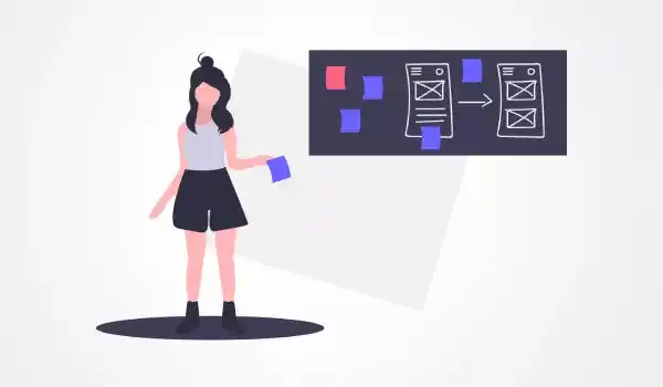
To stay ahead of the competition, it’s still great to keep looking out for any glitches, gaps in features, the latest trends, and ways to make your app better for your users. You may brainstorm with your team and build a list of the cases when a UI redesign is a must.
1. An owner or team doesn’t like the app
A rational appreneur and team can always estimate their own app. If you find a gap or a specific set of needs, it’s best to take that as a starting point to think about a redesign.
It’s also great to look at what your competitor’s apps are incorporating. The insights will keep you ideating and planning your next steps.
2. Requests or queries in an app store
You may have many conscious users who leave their feedback, comments, and requests in an app store. When you look at the data and find that there’s a need for app redesign—well, it’s time you take it seriously.
3. Reduced profitability
You may have a business plan with a chalked-out specific sum or conversion rate. If the conversion rate has somehow reduced or fallen, then it’s time you think of changing the UI design.
4. Changed app idea
When your app idea changes or reshapes, it’s time you restyle the UI. For example, if you have a news app that highlights news of business stars and suddenly shifts to politics and other things, it’s time you think of the redesign.
So, your existing users who are attuned to see the news only about business stars would not be disappointed and look forward to the transition.
5. Users complain about your app
When you look at reviews on the App Store, Google Play, or your app’s community, you can observe red flags.
So, if your ratings are lower than usual or you have multiple negative reviews, it’s time you analyze the negative comments and focus on improvements.
6. Rebranded company
Appreneurs who rebrand their business will need to think of redesigning their apps to stay consistent with the brand’s overall style.
For instance, DoubleClick, an ad tool that was acquired by Google, became Google Ad Manager. When this rebranding took place, Google decided to update the product’s UI/UX to match the style of all other Google products.
Winning App Redesign: A Step-by-Step Approach
One of the best ways to make a champion app redesign is to get started on the right foot. Let’s look at a series of steps that can make the app design experience a positive outcome for both you and the users.
1. Understand Your Redesign Goals
The best place to start with anything is to find out ‘why’ you are doing it. Simon Sinek reiterates the sentiment in his TED Talk.
It’s good to reflect on why you want to redesign your app. Is it due to rebranding? Is your app dated? Do you want to make your app more competitive? Is the app’s UI overloaded?
Once you get insights on the reason behind the overhaul, you could bring in more meaningful changes. The next step is to align the entire design team so that everyone is committed to achieving the overarching goal.
When it comes to meaningful changes, let’s take an example.
United Airlines wanted to make it easier for visually impaired customers to manage all aspects of the day of travel, including check-in, viewing reservation details, flight status, and more. The carrier believes that by improving the accessibility of the United app, they are genuinely living out United’s mission of caring for all customers.
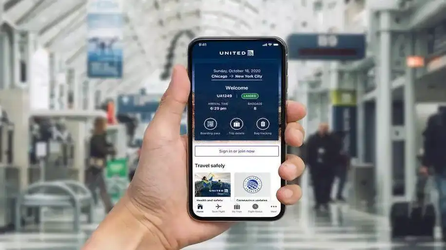
United Redesigned Mobile App for People with Visual Disabilities | Image Source
It’s great to have clarity in ‘why’ you need the redesign, and the insights can be a game-changer.
2. Reach Out to Users and Communicate to Gain Insight
User insights and feedback can facilitate the redesign process. While it’s essential to allow users to communicate, it’s more important that you’re listening promptly.
Promptness is something that people love, and you can meaningfully engage your users to share their current mobile experiences. You can enjoy a competitive advantage by keeping the communication lines open.
Let’s take an example. Slack planned to roll out a new design for its mobile app for iOS and Android. The changes included improved navigation, an easy-to-reach compose experience, shortcuts to apps, and more.
The company announced that they arrived at the new design through a process of user research, iteration, and feedback from participants in their Champions network
We talked about listening; here’s a superb instance. According to Slack, its users are fond of using direct messages to communicate. However, they found that a list of DMs was challenging to reach on both mobile platforms.
The team decided to move recent conversations to the new tab bar. And that’s great! Slack now only includes new communication features, but users can also send feedback on the latest design with the app itself under “preferences.”
3. Analyze Customer Feedback and Reviews
Your existing app is likely to have data. The data includes both qualitative and quantitative facets. Quantitative facets would include stats on in-app usage and engagement, and qualitative aspects would consist of comments, reviews, and messages.
When you collate the data and analyze the data, it could bring you some compelling trends and insights. It is critical that you share them with your design team. The analysis will help everyone be on the same page, especially those responsible for implementing the redesign.
4. Implement Changes to Creating Lasting UX
A mobile app redesign is meant to be transformational. When redesigning, you’d also want it to have a lasting impact on both your brand and business.
For example, when Instagram redesigned its app, they had made some profound changes. One of the head designers from Instagram rightly stated Brands, logos, and products develop deep connections and associations with [users] people, so you don’t just want to change them for the sake of novelty. But the Instagram icon and design were beginning to feel… [that] we could make it better.
Let’s look at another example. Evernote planned a significant redesign, with the latest version including an overhauled note editor. The editor has a cleaner and more consistent look across various devices. The navigation is more straightforward due to a reworked menu.
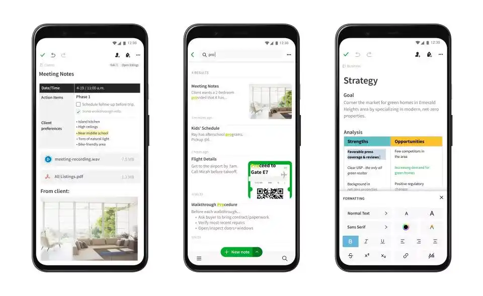
Evernote’s Major App Redesign | Image Source
Evernote used to be a pioneer among note-taking apps but had fallen in stature amid increased competition. It also laid off employees in 2018, amid reportedly stagnant growth.
With the new, easier-to-use, streamlined app redesign, Evernote believes that the app could be more enticing and lure in more users.
As aptly shared by Ian Small, the CEO of Evernote, “It’s the starting line of a new race: the race toward a whole new generation of innovation and improvement in the Evernote experience.”
5. Test Your Redesign and Communicate with Users
After the design overhaul, aka restyling, it’s time you get feedback from people outside your organization. Your first pit-stop could be your existing user base.
You can get feedback to gain insights on the areas where your app needs further refinement. The early research backed with authentic feedback could give you some early validation. It will help to bring gaps and come out as a closer version before launching.
Let’s look at an example. Yelp is a go-to service for everything you need, from a new restaurant to the nearest pharmacy. They had redesigned their app last year, and the app still looked dated in a few places.
Recently, they brought a redesigned Yelp app rolling out to Android, focusing on your preferences and dietary needs. Yelp hopes to make its app more useful by further personalizing users’ experiences.
6. Monitor Usage and User Response After Launch
You may have put in months of research and iteration into design and development. When it comes to launching, you’d want to share the story behind your redesign and the highlights of your new-and-improved app.
As time goes on, you’d need to observe the data, including feedback on the redesigned app. The new data will give you insights into whether the redesign was successful. Did it improve usage? Did engagement increase? Do you find more positive reviews in the app store?
So, now you need to focus your attention on the new data and take that as a starting point for improving your app for the future.
What About the App Redesign Cost?
Let’s look at the next most important question regarding redesigning a mobile app—how much does it cost to redesign an app?
Well, there is no single answer to this question. Why? There are too many facets that need to be taken into account while redesigning. Also, every change required would be different for every business and app.
Here are some top factors that you’d need to keep in mind.
- Does your app need a total overhaul? Sometimes, your app may need a few CTAs and better placement or new skin rather than a new interface.
- What is the technical support that you require? Would you need some new functionality? Most often, the changes would have an impact on technology, which in turn affects the price.
- Is your team equipped to implement the redesign process? If you hire resources or outsource, your costs will change accordingly.
- The most important question is, what’s your budget for the mobile app redesign?
So, What is the Cost Facet of Redesigning An App?
Here’s the thing, if you’re redesigning an app that only has a few screens (let’s say three to four), the cost could range from $1,500 to $7,500. However, when redesigning an app that is probably complex, you’re looking at a budget of $50,000 to $1 million.
It all depends on the features, functionalities, and situations. If you’re in the process of planning a redesign, you may want an expert technology solution provider, such as Imaginovation, to get an accurate estimate.
Your partner can also walk you through the entire redesign process, giving you tips on the industry’s best practices.
Wrapping Up
Redesigning an app can create more meaning. The process may not be easy, and it often comes as a challenge to the design team.
However, when you think of the updated version offering more value to users or getting more users glued to your app, the redesign adventure is worth your effort. With an intuitive app, you can benefit from user engagement and offer a great user experience.
All you need to do is follow a systematic series of steps to enjoy the app redesign journey. The result—happier customers!
Redesign a Champion App with Imaginovation
Redesigning a mobile app can be a grueling task, but it’s even harder to watch your users leave. While the process may be challenging, a well-executed redesign is always worth the effort. If you're aiming for a top-tier product, we can craft a robust, user-centered design that keeps your audience engaged.
Explore our UI/UX Design Services to see how we can elevate your app experience.
We are an award-winning web and mobile app development company in Raleigh, with extensive experience in curating game-changing digital success stories.


