
When designing the web application for your business, what do you focus on the most? Do you find yourself somehow affixed to the aesthetics?
For example:
This logo placed on the right side of the screen doesn’t look nice.
I’m not sure if the shade of gray used on my web app looks appealing.
The choice of font is okay, but it isn’t great. Maybe I should try some other font.
Remember, the main purpose of your web application is to make your business more accessible to customers while optimizing internal business processes and productivity.
That means your focus must be more than just how your web application looks.
Why?
It’s simple. If the user doesn’t find your web app easy to use, they will quickly move on to some other website. Even if you’re creating a web app to automate internal processes, you need to ensure that it is easily accessible by your employees.
Let’s take a look at 10 crucial web design & development principles for 2025 that can lead to better usability.
1. Accessibility
A usable web app is one that’s easy to use.
Have you ever come across any inaccessible website URL – that didn’t work when you tried to access it? Remember how frustrating it was for you – to wait endlessly, not sure what to do next?
Well, as an enterprise, this is the last thing that you want for your website or web app.
Not only is an inaccessible website or web app annoying to users, but it also puts your business at risk. Poor accessibility will lead to poor user experience, which can directly affect your business's bottom line.
So, how to ensure your website or web application is always accessible?
Here are a few basics to ensure your web app is up and running and is accessible:
Responsive Design
With almost 83% of Internet users accessing websites on their mobile devices, creating a responsive web experience has become a top priority.
You need to ensure that your web application is responsive, which means it can be easily viewed on different screen sizes. Responsive design enables the web to fit different screen sizes, comfortably displaying the content.
Broken Links
Double-check for any broken links on your web application. You may use tools like Ahrefs or Screaming Frog to check your website and find all broken links thoroughly.
Server uptime
It’s a good design and development practice to go in for reliable web hosting services. It will help you ensure that your website visitors don’t get any errors trying to access your website.
Keyboard-friendly layout and navigation
A website that’s dependent on the mouse for navigation is not accessible to everyone. Users with some disabilities may need the help of assistive technology for web access. These may include speech recognition software, screen readers, etc.
Use Alt Text on Images
Search engine robots cannot “read” images; instead, they rely on the alt text to tell them what the images contain.
Example
Facebook.com is an excellent example of an accessible web app.
First, it is optimized for different screen sizes. Facebook’s layout is flexible and adjusts automatically as the screen size is changed.
The site’s mobile version has a clean interface with less clutter and a clear hierarchy of content. It works well even with a slow mobile internet connection.
The Facebook website has no downtime, thus making it a trustworthy service platform. It has a keyboard-friendly layout with easy navigation.
2. Do Not Reinvent Design Patterns
You certainly wouldn’t want to create a web app that makes it hard for users to figure it out.
There are quite a few design patterns in the world of web apps that most users are familiar with. They can save designers from reinventing the wheel of their design works. These patterns can help designers focus their efforts on resolving the problem areas as well.
There’s no point recreating design patterns for each page. It’ll confuse users as they’ll have to learn a new pattern.
A design pattern is any reusable idea and design that has already been in use, something like a set of best practices that solve a user-centered problem.
Have you ever noticed how all modern mobile OS use icons to let users access apps?
What if they are swapped with a list or a different UI element?
It is possible. But that would mean the users will need to learn a new pattern every time they switch their mobile devices.
That, in the end, would lead to frustrated users.
So, do not reinvent the wheel. Instead:
- Opt for traditional design solutions with responsive layouts
- The shadow on buttons
- Sufficient white space and clutter-free corners.
Use patterns used in popular apps to help users learn your interface quickly. For Example, the use of specific colors (red for errors and blue for hyperlinks) and icons (envelopes for messages).
Example
Check how some of the apps place their “forward” button always on the right-hand side.
For example, when you try to move a selected post to trash on Facebook, the pop-up displays a hierarchy of options sorted by color and position.

Blue-colored Move button is placed on the right side, whereas the Cancel button with white color is displayed on the left side.
This tells the users that their primary intention – to move this post to trash – is what this pop-up is for.
3. Strive for Clarity
Clarity is the critical element of a usable web interface.
Visitors come to your web app with some goals in mind. If the design distracts or confuses them, they will take more time to find what they initially came for, or they might even forget their initial goal and leave.
So, how can your web app have a clear and usable design?
Focus on the following for creating a clear web design.
Simplicity
A simple design stays focussed on what’s important. It doesn’t distract your visitors.
Familiarity
There is nothing wrong with checking other websites for inspiration. But, it is best to stick to what people already know.
For Example, drag and drop for file uploads and pull and refresh for the latest notifications in mobile apps are standard features. They will not confuse visitors, but a new feature doing similar action will for sure confuse visitors.
Consistency
Create a consistent UX across your entire website to keep your visitors’ minds at ease. No unnecessary surprises, please!
Immediate feedback
Feedback is critical to any online interaction. The moment people interact with your website, make sure to indicate the success or failure of their actions while on the web app.
Example
The website of Apple is the best example of a clear web app.
The web application has a simple UI and focuses on what matters.
The overall appearance of the website is elegant and minimalist. There is a lot of white space. Only relevant content is presented.
The top navigation menu holds the logo, choice of country, categories of Apple products, link to the support page, a search function, and a shopping bag. The site’s footer holds classical secondary links, like the Terms of Use, Privacy Policy, and Site map.
Visitosr on the site will not feel any distraction, making it very simple to pursue their goals on the site.
For example, when the user selects a specific product category, like “iPad” for example, they will get a visual overview of the different iPads available in the top navigation.
Besides, they get a navigation listing all products relevant to this category.
The clarity in design makes an easy UX on the website for all Apple products.
4. Provide Visual Cues
Visual cues are powerful tactics to subtly draw users’ attention to areas of importance on your web application.
You can use images, symbols, colors, and layouts on your website to provide much more than just aesthetics. They can provide visual cues. They differentiate a static and unintuitive design from a smart one.
It’s always good to give your users a clear direction. Please don’t keep them hanging.
Especially when it comes to taking action or when a transaction is happening, there should always be visual cues about what’s going on.
Remember not to be very obvious when you try to grab your website visitor's attention.
You can do it subtly using visual cues; that will improve your website’s overall design and will still give the required effect.
Example
Look at the Paypal loading screen shown below.

Have you noticed a circular animated icon, which appears on many other websites when the website loading takes a bit of time?
This circular animation gives you a clue that there’s a process underway, based on the action you have taken. The clue tells you to stay patient and wait.
You can also use the color of the call to action button on your website to draw the user’s attention. You can also choose a different style of the text in the call to action button, make them bold, or use another font.
5. Establish Credibility
Do you know why credibility is a crucial aspect of your website?
Well, because it shows your business is safe and trustworthy.
But can a website establish the trustworthiness of a business? How?
Yes, your website can impact the credibility of your business. It is very often the first stop for your prospective customer.
When a customer arrives at your website via search engines and social media, the first question that crosses their mind is – Can I trust this business?
Your website visitors can become skeptical about your business in any number of ways – including whether or not your business exists, your reputation, or the quality of your content.
Your website must show you are a real company with real people. Take the following steps:
- Design a clear “About Us” page.
- List a physical address with a contact number.
- Make sure you are precise about your content. There should be no mistakes – incorrect grammar or misspellings. Keep the content updated.
- Show third-party testimonials or the number of your social media followers.
- Publish your website’s privacy policy.
- Improve your website’s load time.
- Your website must be secure.
Example
The brand MAC has done a great job in building web credibility.
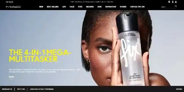
Besides the professional design, they offer high-quality content to demonstrate their products.
For example, an entire content section covers how the brand stands by working towards an animal cruelty-free world. It also shows the key ingredients used in products and that they are safe for the skin.
It is not difficult to get in touch with MAC. The brand is available via social media, and physical addresses and phone numbers of various store locations are easy to find.
6. Group-related Elements
UI design relies a lot on the principle of proximity, which encourages us to place related elements near each other and unrelated elements separately.
Why?
Well, because your users should be able to guess where to find control or information, and grouping related elements together help make sure it happens.
What happens if you don’t group them?
The elements may appear unrelated and can be easily overlooked by the users.
Pay special attention to the proximity of elements while working on a responsive design. Because as they adapt to the different screen sizes, groupings may also change.
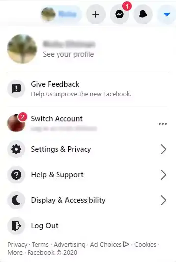
Example
Have you noticed how features like logging out, profile, settings, switch accounts, etc., belong together and are generally placed around each other?
Features like Return Policy, Privacy policy, and About Us are all placed together.
We usually connect them with colors and styles or even put them in the same box to group them.
For example, the Account tab on Facebook will give you many related features grouped together, as displayed in the accompanying screenshot.
7. Provide Unobtrusive Help
The UI of your web application must be as intuitive as possible. But, whenever required, your website must give the users a gentle push in the right direction.
You can create walkthroughs or Product tours for your users.
The idea is to let the users learn on their own and offer help only when needed.
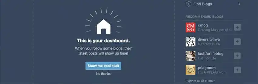
Example
The microblogging site Tumblr gives an option to take a tour or skip it.
8. Provide Easy Navigation
Provide easy navigation to your website users.
It’ll help them easily find what they’re looking for.
Do you know what an ideal scenario is?
When visitors land on your site and they don’t need to search for the link or button to browse information. Navigating from one part to the next has to be frictionless.
Here are some tips for designing your site’s navigation:
- The structure of your primary navigation should be simple.
- Include navigation in the footer of your site.
- Use breadcrumbs on every page so that users can remember their navigation trail.
- Add a search bar near the top of your site so that visitors can easily search by keywords.
- Avoid offering too many navigation options per page.
Don’t make your users dig too deep while navigating. It’s best to keep your map not more than three levels deep.
Example
When a user visits any website, they look for ways to search for information while navigating. Hubspot’swebsite’s primary navigation structure looks simple and provides just the right way to its users.
Since Primary navigation usually includes the essential information of a website, Hubspot’s Primary navigation consists of all the crucial options to Search, Login, Customer Support, Pricing, etc.

It helps users find their way easily, even if they get lost on the website.
Besides, it provides breadcrumb navigation to tell its visitors where they currently are on the website and how to return to the homepage when required.

The search bar near the top of the site makes it easy for visitors to search by keywords.
9. Consistency in Design
You must keep the overall look and feel of your website similar.
Why?
Well, if your website is not consistent, it’ll slow the navigation of visitors, making them lose interest in your website, and they will leave your website.
Besides this, there’s a time and cost-saving benefit with a consistent design.
So, if your web app uses a consistent approach, your web developer will need to create a small number of reusable templates for your pages. It’ll cut down on the overall development time of your website and thus save you money.
So, what comes under consistent design?
- Use the same colors throughout the website.
- Consistent spacing between elements.
- Use of the same colors in-text links.
- Consistent headings across the website.
- Navigation menus are placed in the same place throughout the website.
Example
Airbnb uses the same layout for all of its “Help Centre” pages. Notice carefully, and you’ll find the company has used the same color combination throughout the pages. There is consistency in fonts’ use, horizontal and vertical spacing between the website elements and their placement.
Imagine what kind of an experience the user would have if every “Help Centre” page had its own unique layout. I’m sure it’ll be anything but pleasant.
10. Load Quickly
Most users expect a regular website to load in 2 seconds or less. Anything more than 2 seconds is considered slow.
Do you believe website load time is solely the responsibility of web developers?
Web designers can play a huge difference in the load time.
Let’s learn how:
- Avoid using rare fonts.
- Make judicious use of social media buttons. – Too many social media plugins cause latency.
- Optimize your image size.
- Manage user wait time by providing engaging animations.
Example
One of the best examples of companies that have improved their website speed is Walmart. The company has reported an improvement in conversions and revenue after increasing its website speed.
The company has made sure they’ve used simple fonts on their website and no fancy and rare fonts. There is the judicious use of the number of social media buttons displayed.
Walmart has used only the essential social media plugins meant for an e-commerce site – Facebook, Twitter, Pinterest, YouTube, and Instagram.
Wherever the website’s content is too much, accordions are used to segment and structure such content. You will find them designed as ‘Read more’ buttons. Accordions are a great choice for reducing the website’s load time as well.
So we can see there are different principles to designing and developing web applications that provide preference to user experience.
Create A Modern & Powerful Web Application with Imaginovation
If you want to create a web application for your business with an excellent UX or plan to redesign an old app, get in touch with us.
We will help you create a web application based on the best practices for designing.
We are an award-winning web and mobile app development company with vast experience in crafting remarkable digital success stories for diverse companies. Let’s talk.
Author


Co-Founder
Ready to build an app, but not sure where to start?
We've got you covered. Click the button below to get started.