Get a personalized assessment of your operational efficiency and accelerate growth for your business.
The healthcare landscape has taken a quantum leap. And the businesses in the healthcare sector need to be bolstered by high-performing medical websites.
Why?
Most people still struggle to find the right medical information online. This is where a well-designed medical website can make a difference.
With trending medical website design principles along with usability best practices, medical sites can create a niche. They can be a brilliant platform augmenting the patient experience.
Such efforts can keep your website at the forefront of design, rank well, and convert better. Keep reading to learn more about some of the key design principles for medical websites.
The Need to Transform Patient Journeys through the Digital Revolution—Vital Statistics
Picture this—you want to schedule a dentist appointment. One of the first things you may do is run a quick search for dentists before scheduling an appointment. Many healthcare consumers start their journey by finding providers online.
So, it’s straightforward; if you build an online platform that provides accurate medical information, people will value it.
Here’s a peek into some crucial statistics.
- Around 5% of all Google searches are health-related. (Source)
- In the U.S., experts expect healthcare advertising spending to increase by 5% in 2022 and 2024. (Source)
- 80% of consumers [customers] state that the experience a company provides is as important as its products and services. In short, expectations for the customer [patient] experiences have never been higher. (Source)
- In most major healthcare verticals, nearly 60% of consumers run a search prior to scheduling an appointment. (Source)
- 94% of healthcare patients look at online reviews to evaluate providers. People prefer to check out online patient reviews to get a feel for your practice. (Source)
The opportunity in the online healthcare scene is evident. You can create an impact, boosting patient experience with apt medical website designs.
Online Medical Website Design Nightmares
It’s a no-brainer—terrible digital experiences can lead to consumers’ frustration. As healthcare providers, it is a constant quest to keep digital patient experiences on the top of your mind and offer innovative digital solutions.
As Florian Otto, CEO of Cedar, stated aptly, “Modern consumers [are] armed with new levels of data, treatment options, and heightened expectations.” Otto added that “now [they] demand more, and further stated that the industry must rise to the challenge.”
Healthcare providers must rethink the end-to-end patient experiences and improve outcomes. When consumers find more desirable solutions, it would lead to higher converts and boost ROI.
Where can you start?
As the first step, you can examine lousy digital solutions and make sure that you weed them out.
Here are some quick tips for don’ts in website designs.
- Websites that are not self-explanatory
- Sites that are difficult to navigate
- Sites that have too many pop-ups
- Sites that use overly small font sizes
- Websites that have unclear link text and dead links
- Websites that are not mobile responsive
When users have a terrible experience, it’s a lost opportunity. What can you do? You can revamp your website or build one with design principles that augment the best patient experience.
Medical Web Design Principles that Help Boost Patient Experience
Medical website development is an excellent opportunity to help people with accurate information, augmenting user experience.
Here’s all you need to know about creating stellar medical websites through well-tested design principles.
1. Fully Responsive to Mobile and Tablets
It’s exciting to look at website statistics for 2021. One interesting area to focus on is building a mobile-friendly website. According to a study, 74% of people are more likely to return to a website if it is optimized for mobile devices.
Here’s another statistic highlighting that 85% of adults think that a company’s website should be as good or better than its desktop website when viewed on a mobile device. (Source)
So, you may want to make sure your site looks great on mobile devices and tablets.
In other words, your medical website should feature a responsive web design. Responsive websites create a high-quality user experience on all devices, and healthcare professionals should not overlook this facet.
What can you do?
You can apply the (KIS) keep it simple web design principle. Plus, consider putting the menu behind a hamburger button on mobile and go for minimalist design. It will help to optimize your website for mobile.
Furthermore, consider using a CMS that offers automatic mobile responsiveness. A simple design most often contributes to faster load times and happier consumers.
Let’s look at an excellent example. One Medical has a great mobile-friendly (on both iOS and Android) layout that’s intuitive for mobile users.
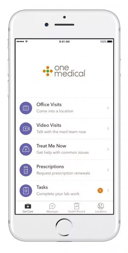
One Medical with a Mobile-friendly Interface | Image Source
2. Ensure it is Interactive
Do you use interactive content to influence the patient’s journey? Are you wondering why you need one?
Well, interactivity can help augment engagement and also achieve your conversion goals. Here are some impressive stats.
- According to a study, 79% of content marketers (respondents) agreed that interactive content enhances the reputation of a brand’s message and 79% thought this content led to repeat visitors and greater online exposure.
- In yet another study, 88% of marketers stated that interactive content differentiates them from their competitors. (Source)
- Interactive content wins two times more engagement than static content. (Source)
If you’re used to creating static content, you can rethink making your websites more interactive. The switch can help to grab the attention of website visitors. Furthermore, it can enhance the reputation of your brand’s message, and lead to repeat visitors.
What can you do to make websites interactive?
You can create interactive forms, have a clear call to action (CTA) buttons, and provide patient portals. Such features boost the patient experience, helping to outshine the competition.
A great interactive healthcare website design example is Friends of Family Health Center. The website offers interactive videos that display their top-tier facility.
Moreover, the site provides a patient portal that encourages patients to take up more active roles while managing their care.
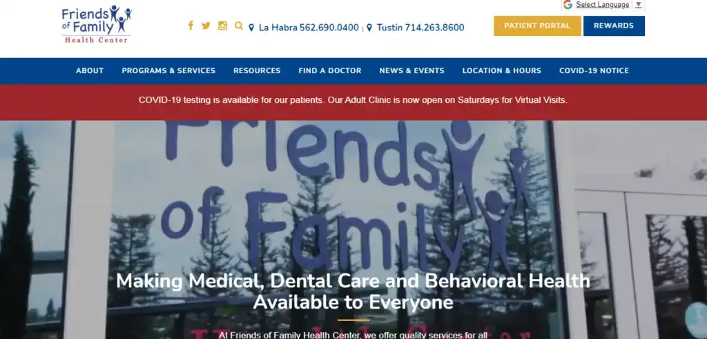
Friends of Family Health Center Website | Image Source
3. Ensure Easy Navigation
Picture this—consumers spend a lot of time online, and if they can’t find information easily on products and services, it can be a frustrating experience.
What’s the solution?
If the navigation is easy, then users can immediately find information, saving time and effort.
Here are some interesting stats. According to a study, 94% of the respondents stated that easy navigation was the most useful website feature.
So, consumers can’t find content effortlessly; it can steer them away from such sites.
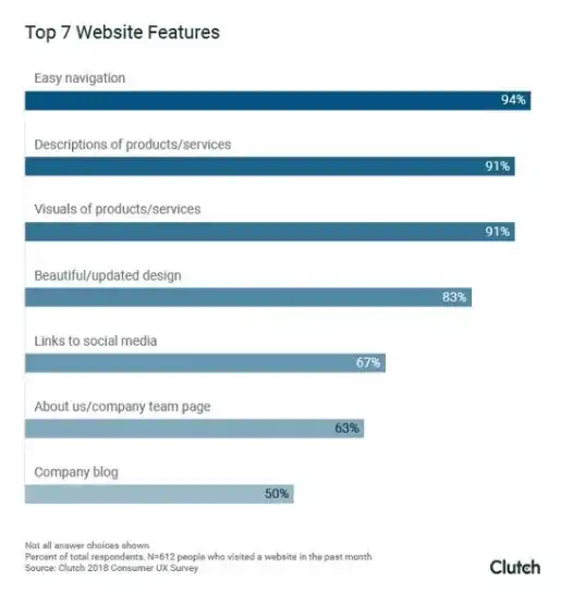
Top Website Features | Image Source
What can you do? When developing a medical website, make sure that there is a well-designed menu for your most important pages and clear calls-to-action (CTAs).
It can help to have a doctor or specialist lookup and an internal search function. When patients can easily navigate to book appointments, it will help to get better converts.
Let’s look at a brilliant website example that facilitates easy navigation. Centura Health has a site that features an excellent blend of primary navigation and secondary icons.
Patients can easily search for anything on the site. Plus, it is easy to schedule virtual visits, which increases the user-friendliness of the website. That’s one must-have feature for your medical site.
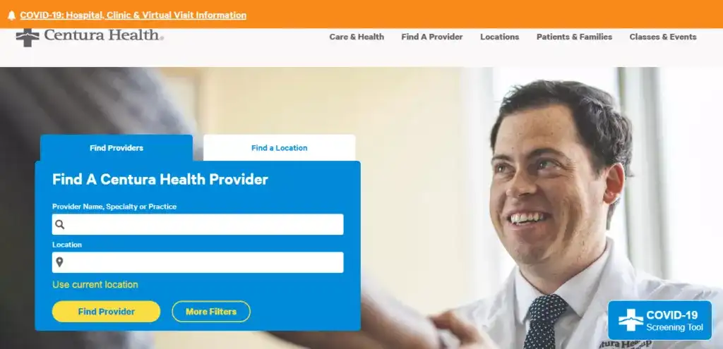
Centura Health Website | Image Source
4. Provide Valuable Content
Content is still the king!
When you provide valuable content, it can empower patients to take care of their health needs. It will also inspire first-time visitors to click through content on your site and encourage existing patients to visit often.
If you wish patients to get the most out of your products and services, try custom content that takes medical web design to the next level. According to Dragon Search Marketing, 61% of [customers] consumers are influenced by custom content. (Source)
That’s huge!
*What can you do?** *
You can share valuable content through curating regular blog posts, featuring a Q&A page, and adding patient reviews. Testimonials are among the most prominent features that you can add to boost your potential patients’ confidence in your care. Such reviews highlight your healthcare facility’s authenticity.
A great web design example that features patient reviews and testimonials is Arkansas Surgical Hospital.
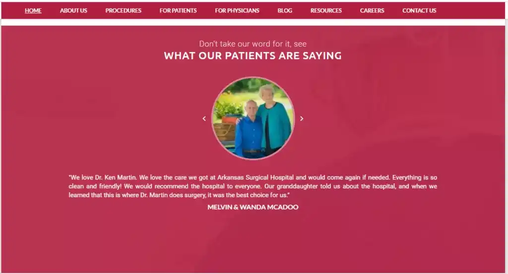
Arkansas Surgical Hospital Website | Image S
5. Improve Load Speed
Load speed can make or break a website. Today, loading is not just a matter of preference, but it is critical to your medical site’s success.
It’s quite simple the longer a webpage takes to load, the more it will increase the bounce rates. In short, you need to focus on optimizing website speed.
Here’s an attention-grabbing insight. According to a study, pages loading within two seconds show an average bounce rate of 9%, and pages loading in five seconds have bounce rates to the tune of 38%.
So, even a one-second difference in loading can create a massive impact on performance.
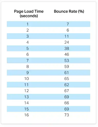
Bounce Rates for Every Second of Page Loading | Image Source
So, how fast should a website load? Typically, your website should load within three seconds (two seconds if it’s an eCommerce site).
What can you do?
It’s essential to optimize your mobile page speeds as much as possible, as it is still the preferred method for browsing. You can also turn to Accelerated Mobile Pages (AMP) that allows mobile pages to load much faster.
Plus, you can quickly try limiting and compressing images and reducing the number of redirects. You can also measure with Google’s free PageSpeed Insights tool. The results can highlight potential loading issues and adjust your web pages to minimize load time.

Google’s PageSpeed Insights Tool Interface | Image Source
West Coast Endodontics and Sedation Centre is an excellent healthcare website design example that dons a minimalist look. The site has a limited number of pages and some captivating photographs.

West Coast Endodontics and Sedation Centre Website | Image Source
6. Choose Strong and Engaging Imagery
Pictures used aptly can speak a lot more than words. Text-only posts can get monotonous. You can spice up engagement levels with compelling imagery. In fact, according to a study, images produce around 650% higher engagement than text-only posts. (Source)
When it comes to medical website design, choose high-quality photos to showcase the quality of the products and services you have to offer. Plus, add videos to enhance engagement levels.
What can you do?
It is crucial that you strategically place visual elements (images and videos) that visitors can connect to immediately. It is always better to feature original photos and videos and also feature original graphics.
Mercy Health’s website is an excellent example of strong imagery. The site has some incredible images well-blended with colors that engage visitors. The web pages don a consistent look-and-feel of rich and colorful photography that helps incite excitement.
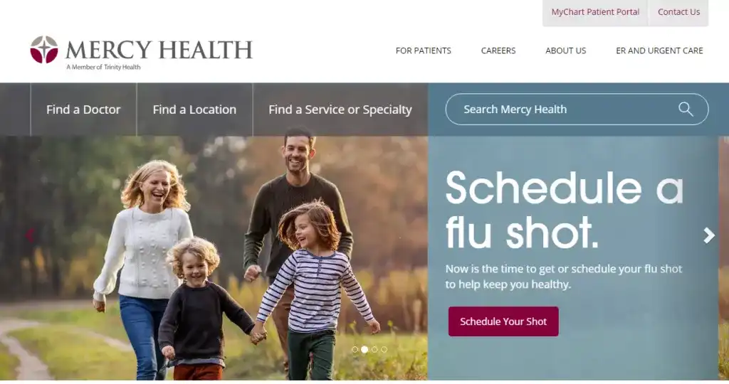
Mercy Health Website | Image Source
7. Reaffirm Your Brand Messaging
When you choose a medical web design, remember that it can define and differentiate you from your competitors. It is best to have a clear brand message that stays with your website visitors.
Often, people visiting have very little time to search for in-depth information. So, you must make the most of that short slice of time to reaffirm your brand message.
What can you do? The key to success is consistency. Make sure that you have the same color scheme across all your web pages. Choose a professional font face, and choose images that are well-blended with high-impact text.
TMEDED is a brilliant medical web design example. The website has fantastic photography and fonts. The web pages are a perfect combination of green and white with neutral colors blending in the visuals. Plus, each page dons a clean and modern design with simple navigation across the site.

TME Website | Image Source
8. Ensure Web Accessibility Guidelines
Accessibility is increasingly significant in making health care more inclusive. That’s precisely why an accessible medical website design is critical to serving all individuals, including patients with disabilities.
The guidelines can get overwhelming. You can always choose to take the help of a professional web developer, such as Imaginovation, who can help curate an accessible medical website.
What can you do? You may choose to look at the accessibility guidelines. Furthermore, direct web developers to use high-contrast colors for your web pages. Plus, select text that’s larger and easier to read at lower contrast.
Also, add alternative-text (Alt-text) and images to your website’s HTML code under images, non-text elements, and graphics. The Alt-text helps visually-impaired visitors who are using screen reader technology to understand your page’s content.
An excellent example of an accessible medical website is Good Shepherd Community Care. The site has excellent characteristics of good accessibility, with high-contrast colors and large text. The features make content easy to view. The use of alt-text facilitates those with screen reader technology to understand the images better.

Good Shepherd Community Care website | Image Source
Healthcare web design is more critical than ever. You can create an engaging design that can augment the patient experience.
Remember, when they find valuable medical information online quickly, it is sure to garner patients’ attention.
Bonus Medical Web Design Principles
Here are some quick medical design tips for you. These principles can add to the success of your website.
- Highlight your features services on the home page.
- Ensure your site has an active blog area.
- Apply proper medical SEO and keyword research.
- Use lead forms to make it easy to request appointments.
- Support potential patients to sign up for your newsletter.
- Showcase the patient before and afters.
- Strive for consistency in fonts, colors, and aesthetic look and feel.
- Permit easy reversal of actions.
- Ensure registration forms are simple.
- Ensure thumb-friendly mobile navigation.
Features of Medical Website Design
It helps to research intensively and come up with a comprehensive set of features. Furthermore, look at the features that can help to serve your niche consumers the best.
An extensive feature set is critical to the success of your medical site. Here’s a quick peek at some must-have features.
- Full Contact Data: It is vital to provide clear and accessible contact information. Remember that the patient should not spend extra time to find the addresses or phone numbers of your clinic or health care center.
- Main Services: It is significant that you communicate the kind of healthcare services that you are offering.
- Online Consultation: Offer consultations with physicians online, which will facilitate website visitors and future patients.
- Appointments: The feature is a must-have to make an appointment with a doctor remotely.
- Information about Doctors: It is a great way to attract patients to your clinic. So, add detailed information about doctors, including their experience, awards, achievements, specialization, and more.
- Success Stories: Another significant facet is to have case studies of successful treatment and before-and-after stories. The information can empower patients to take necessary action.
- Blog Section: It is essential to have an active blog section where you can add news from the medical field, treatment options, useful tips, and more.
- Patient Feedback: Testimonials are very critical. Remember to add reviews that can help convince other people to go to your clinic.
The Final Word
You can quickly turn your medical website into a useful tool for your healthcare business. All you need to do is strategically use the medical web design principles and stay tuned to changing trends.
Plus, remember that medical website development can get challenging. You can get in touch with an experienced technology solution provider, such as Imaginovation, who can help create a stellar medical website.
Build Outstanding Medical Websites with Imaginovation
Ultimately, as healthcare professionals, you can discover the power of a well-designed medical website that can empower patients with cutting-edge digital initiatives. With the right technology solution provider, the medical website designing journey can be very meaningful. We keep your mission care model at heart and improve patient outcomes, quality of care, and boosting ROI.
We at Imaginovation have helped many healthcare businesses with impressive digital solutions. Let’s talk.


