

Get a personalized assessment of your operational efficiency and accelerate growth for your business.
Have you ever stopped to ask how much revenue your app might be quietly losing to poor UX?
Behind every clunky flow or buried button, there’s money slipping through the cracks. And most teams don’t even realize it’s happening.
User experience (UX) isn’t just about clean layouts or trendy fonts. It’s about how people feel when they interact with your product, how easily they can move through it, find what they need, and come back again.
If that experience is confusing or frustrating, you're not just losing users. You're losing revenue.
In this post, we’ll take a closer look at how UX architecture can be intentionally designed to support real business goals.
Whether you're aiming to boost conversions, reduce churn, or increase customer lifetime value, better UX can drive serious results.
Let’s get into it.
The Hidden Costs of Poor UX Architecture
Poor UX is a silent killer for business growth. Design flaws can erode revenue in subtle and yet significant ways.
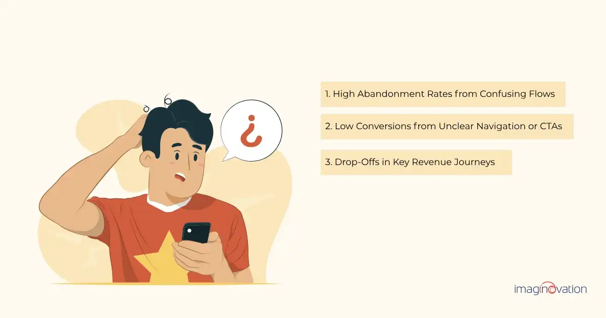
1. High Abandonment Rates from Confusing Flows
No one wants their app to be remembered for all the wrong reasons.
Take Workday, for example. It’s a powerful platform used for things like HR, payroll, and finance, but it’s often criticized for being hard to use.
One of the biggest complaints? The headache of applying for jobs through the system.
This kind of user frustration isn’t rare. According to the Baymard Institute, nearly 70% of online shopping carts are abandoned, and a big part of that comes down to poor user experience.
Complicated steps, confusing layouts, or unclear instructions make people give up before they finish what they came to do.
The bottom line? If your app is hard to use, people won’t stick around. They’ll leave and likely won’t give it a second shot.
2. Low Conversions from Unclear Navigation or CTAs
Users won't take action if they don’t know where to click.
Your call-to-action (CTA) needs to be clear and easy to find. When buttons are buried in cluttered layouts or competing with too many choices, people get overwhelmed and leave without converting.
This kind of friction is more common than it should be.
For example, the U.S.-based travel deal site Going ran an A/B test on its homepage CTA. They simply changed the button text from “Sign up for free” to “Try for free” — and saw trial starts more than double, with a 104% lift in conversions.
Why? The new CTA was more inviting and easier to act on.
The same principle applies across SaaS and fintech apps. Pages with multiple CTAs like “Learn More,” “Try Free,” and “Talk to Sales” often lead to decision fatigue.
But when layouts are simplified and messaging focuses on a single, well-placed button like “Get Started,” conversions tend to rise.
The takeaway? Clear, focused CTAs reduce friction and guide users toward action.
3. Drop-Offs in Key Revenue Journeys
The checkout process is a critical point in the user journey where even minor UX issues can lead to significant revenue loss.
When users encounter confusing steps, unexpected costs, or unclear navigation, they're likely to abandon their purchase.
A pertinent example comes from a case study involving a travel management company's desktop application. The original multi-step checkout process was cumbersome, leading to user drop-offs.
By redesigning the flow into a more streamlined, single-page experience, the company aimed to reduce friction and improve completion rates.
As Pete Peranzo, Co-founder of Imaginovation, aptly states: "The moment of payment is the moment of maximum friction and maximum opportunity. A poor payment flow doesn’t just lose revenue, it loses trust."
This underscores the importance of a seamless checkout experience in retaining users and maximizing conversions.
UX Red Flags That Are Costing You Money
Your users may already be giving you silent signals, and if you are new, you can learn from other apps.
The insights can help you spot critical UX red flags and fix them without getting into a full redesign mode.
Here are some of the top contenders.
1. Bounce Rates and Drop-Offs on High-Intent Pages
A simple rule is to pay attention to high-intent pages like pricing, signup, or product detail pages.
If they are bleeding traffic, it's not your traffic strategy; it's most likely your UX.
Remember that high bounce rates on these pages often highlight that layouts could be confusing, have slow load times, or have unclear CTAs. Users arrive with intent but somehow leave with frustration.
Solution: Consider using GA4’s user flow and drop-off analysis to pinpoint where attention turns into exit.
2. Negative Reviews Citing Usability Issues
Poor UX appears in many ways, such as in-app store reviews, churn surveys, and customer support tickets.
Often, there will be a goldmine of feedback, and what you need to listen to is "too complicated," "it's too frustrating," and "couldn't find what I needed."
Every usability complaint is a chance for you to fix a conversion blocker.
Solution: Try tools like FullStory that let you replay sessions to see the exact moment users struggle.
3. Low Session Durations or Repeat Visits
Here's the thing: if your users are not staying or, say, coming back, it is a definite sign that your app isn't delivering value, or it's hard to navigate.
For instance, short session durations in content-heavy or SaaS products mean your architecture isn't guiding users to deeper value. In eCommerce, it means fewer items per cart or more abandoned journeys.
Solutions: Try using Hotjar heatmaps and scroll tracking that show where attention drops off — and why.
4. Bonus: Mobile UX Complaints = Lost Revenue (Especially in eCommerce)
Another facet that one must know is that mobile-first isn’t optional anymore.
Thus, if you have a checkout button cut off on the screen or a form that doesn’t auto-complete, it can kill conversions. That's huge because, for many verticals, approximately 60–80% of traffic is mobile.
Solutions: Consider using GA4 device reports and mobile session recordings that can help you prioritize mobile UX fixes.
Bottom line: UX issues directly impact revenue and frustrate your users. It's simple: the earlier you catch these red flags, the faster you can convert friction into growth.
How to Align UX Architecture with Revenue Goals
UX isn't just about how things look or function. It plays a direct role in driving business results.
Clients often start by saying, “We want it to look amazing.” And while visuals matter, a beautiful interface without solid UX is like a Ferrari with no engine — it looks great but doesn’t go anywhere.
That’s why shifting the focus from just aesthetics to long-term value is essential. Good UX architecture guides users, removes friction, and supports goals like conversions and retention.
Here’s how to align your UX with what really matters — your bottom line:
1. Define Clear Business Goals
Before you make any UX decisions, you need to know what you're working toward. Without clear goals, even the best design will miss the mark.
Start by identifying the core outcomes your product needs to support. Is the priority to increase sign-ups, reduce churn, raise average order value, or drive upsells? Your UX strategy should directly support those targets.
Once the goal is defined, you can shape UX around it. For example:
- Want more conversions? Simplify your sign-up flow and reduce steps.
- Aiming for better retention? Invest in a smoother onboarding experience.
- Looking to increase upsells? Add personalized prompts or feature recommendations at the right moments.
Tying UX improvements to measurable business outcomes helps you prioritize what really matters — and prove the value of your work.
2. Map Key User Journeys
If you don’t understand how users move through your product, you can’t fix what’s slowing them down.
Mapping user journeys helps uncover pain points — whether it's drop-offs during sign-up, confusion in onboarding, or friction at checkout. Once you spot where people are getting stuck, you can design targeted fixes that directly support business goals.
For example, simplifying the onboarding flow could boost activation rates if users abandon the app during sign-up. That change alone can lead to higher retention and greater lifetime value.
When UX decisions are tied to specific stages in the user journey, it becomes easier to prioritize work and make a clear case for ROI.
3. Streamline Critical User Flows
Your most crucial user flows — like sign-up, onboarding, checkout, and upgrades — have a direct impact on your bottom line. Users will drop off before converting if these journeys are clunky or unclear.
Here’s how to spot and fix problem areas:
- Identify friction points. Look for where users hesitate, are confused, or abandon the process entirely.
- Simplify steps. Too many clicks, unclear actions, or buried features can overwhelm users.
- Make key actions visible. CTAs like “Upgrade” or “Start Free Trial” shouldn’t be hidden in a settings menu.
For example, a SaaS company struggling with free trial conversions discovered that:
- Users were overwhelmed by a complex dashboard with no guidance.
- The upgrade button was buried in the settings.
They responded by:
- Adding a simple, guided onboarding experience.
- Embedding feature demos where users naturally explored the product.
- Surfacing upgrade CTAs at high-value moments.
The result? Conversions jumped from under 5% to 18%.
The takeaway: Streamlining key flows helps users get to value faster, and that leads to more conversions, better retention, and higher revenue.
4. Use Data to Guide Decisions
Great UX isn’t built on gut instinct; it’s shaped by real user behavior. Data helps you move from guessing to knowing where users struggle and why they drop off.
To design smarter, focus on:
- Click paths to see where users are going, or where they get stuck.
- Heatmaps to understand what’s getting attention and what’s being ignored.
- Session recordings to watch real users in action and spot friction firsthand.
- Funnel drop-offs to identify where revenue is leaking.
Real-world examples:
Upfor, a social platform, had users signing up but not sticking around. The issue wasn’t the features but the cluttered, MySpace-style navigation. A UX revamp made the experience more guided and intuitive. Within 45 days:
- Active group creation went up 30%
- Repeat user sessions increased by 22%
The takeaway:
Data doesn't just validate design decisions, it points directly to what’s broken and what to fix. Insight-led UX changes lead to better engagement, stronger retention, and real business results.
5. Optimize for Mobile and Performance
Mobile users expect speed and simplicity. If your app loads slowly or feels clunky on smaller screens, they’ll bounce — often before you even have a chance to convert them.
To improve mobile UX and protect revenue, focus on:
- Fast load times. Even a few seconds of delay can hurt conversions.
- Responsive layouts. Design should adapt smoothly to all screen sizes.
- Touch-friendly interactions. Buttons, forms, and navigation should feel effortless on mobile.
A quick example:
An e-commerce brand discovered that mobile users were leaving at nearly twice the rate of desktop users. After running a performance audit, they uncovered oversized images and sluggish page loads. By optimizing their assets and simplifying mobile navigation, they boosted mobile conversion rates by 27%.
The takeaway:
Treat speed and mobile usability as part of your design strategy, not afterthoughts. Performance is UX, and it directly affects revenue.
6. Personalize Where It Counts
Personalization isn’t just a trend — it’s a powerful way to increase engagement and lifetime value. When your product feels relevant to the user, they’re likelier to stick around, return, and convert.
Effective UX personalization means:
- Tailoring content or recommendations based on user behavior and goals
- Adjusting flows depending on where users are in their journey
- Using data to deliver the right message at the right time
Real-world impact:
A subscription-based learning platform boosted customer lifetime value by 35% after introducing personalized course suggestions. By analyzing users’ past interactions and goals, the team delivered content that felt tailored, and it paid off in both satisfaction and revenue.
The takeaway:
Intelligent personalization doesn’t just improve the experience. It creates loyalty, increases relevance, and helps turn casual users into long-term customers.
Your UX Improvement Roadmap
Ready to start turning UX friction into business growth?
Here’s a quick-action roadmap to help you spot issues, prioritize improvements, and make your product more intuitive and profitable, one step at a time:
1. Conduct a UX Audit with Real User Data
The best way to improve UX is to see what users are actually doing. Use tools like session recordings, heatmaps, and funnel analysis to spot where they’re getting stuck or dropping off.
Pair that with usability testing to uncover friction points that raw data might miss, like confusing language or unclear flows. Key metrics to track include:
- Drop-off rates
- Time to complete key tasks
- Signs of hesitation or confusion
This mix of quantitative and qualitative data gives you a full picture of what’s working — and what’s not.
2. Prioritize Fixes That Impact Revenue
Not all UX issues are created equal. Focus your efforts on the parts of the user journey that directly affect revenue, like sign-up, onboarding, checkout, and feature adoption.
To decide what to tackle first, look at:
- User frustration — where are people getting confused or dropping off?
- Business impact — which fixes will move the needle on conversions or retention?
You’ll get faster results and a stronger case for continued investment by aligning your UX priorities with your growth goals.
3. A/B Test Critical UX Changes
Before rolling out significant UX changes across your product, test them. A/B testing helps you validate what actually works — and what doesn’t.
You can test elements like:
- Button copy
- Page layouts
- The number of steps in a flow
Measure success with clear KPIs such as:
- Higher conversion rates
- Lower bounce rates
- Faster task completion times
Data-backed decisions lead to smarter, more effective design.
4. Work with a UX-Focused Design and Development Partner
Sometimes the fastest path to better UX is teaming up with people who’ve done it before. Look for partners who understand both design best practices and how to tie them to real business goals.
The right team can help you:
- Spot and fix usability issues
- Align UX improvements with revenue metrics
- Build solutions that are both user-friendly and technically sound
Pro tip: At Imaginovation, we help teams audit, refine, and scale their UX with a focus on growth. Every recommendation is backed by data and tested with real users.
Wrapping Up
By now, it should be clear that your product’s user experience isn’t just a design detail. It’s directly tied to how people engage, convert, and stick around.
If you’ve seen signs of drop-off, low engagement, or friction in key flows, now is the time to act. The good news?
With the right UX strategy, those pain points become opportunities.
At Imaginovation, we partner with businesses to uncover what's holding users back and design solutions that create lasting impact. From audits to full-scale redesigns, we bring together UX best practices and business goals to deliver results that scale.
Let’s create an experience that works for your users and your bottom line.