


Get a personalized assessment of your operational efficiency and accelerate growth for your business.
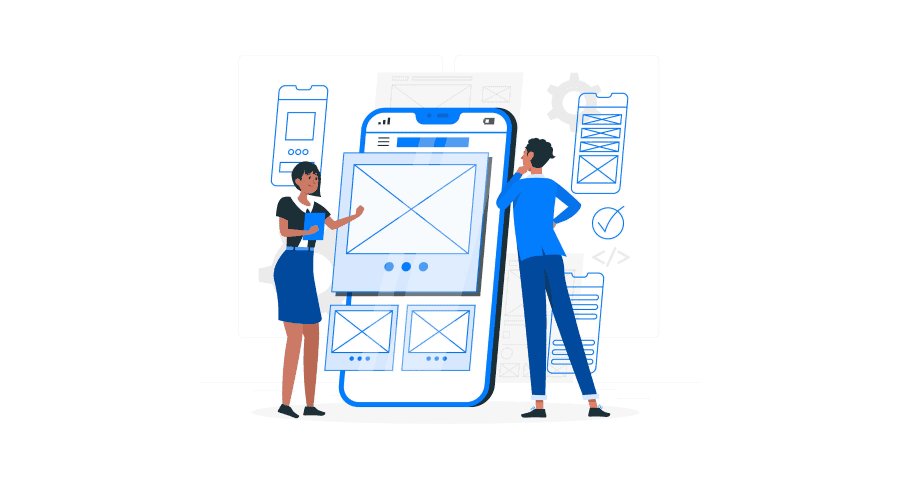
UX design is one of the most critical aspects of successful product development. If the product doesn't offer a good user experience, the audience will reject it even if it can solve their pain points.
It's also probably one of the most complicated aspects of product design. Designers are rarely the end users for most products, making it challenging to step into the user's shoes and gain their perspective.
However, over the years, experts have developed principles that help teams create better designs. In this blog post, we explore the importance of these design principles and dive deep into the ten most important principles that can help you design better products.
Introduction to UX Design Principles
UX design principles are guidelines or rules of thumb that help designers understand their audience better, offer insights into how they may behave, and define what constitutes good design. These principles provide designers with a platform or baseline to start their design process instead of building from scratch.
UX principles have evolved over the years after studying users, designs, and how the two interact. Designers use these principles to guide their design process and make decisions. They help reduce the cost behind these decisions; designers can avoid common mistakes or pitfalls and reduce the trial and error involved in the process.
Even if designers are working with a new interface or building a product that the general population has never seen or experienced before, these guidelines can make the product at least closer to user expectations. They can help designers reduce costly redesigns and avoid product recalls.
These principles have helped organizations fast-track their design processes. They have aided many small businesses in launching successful products with limited resources. Even as product interfaces, materials, technology, and design trends have evolved over the years, these UX principles have remained consistent and have helped development teams deliver good results.
10 Fundamental UX Design Principles You Need to Know
These are some of the essential UX design principles that can guide you in creating designs your audience will love and that produce good results.
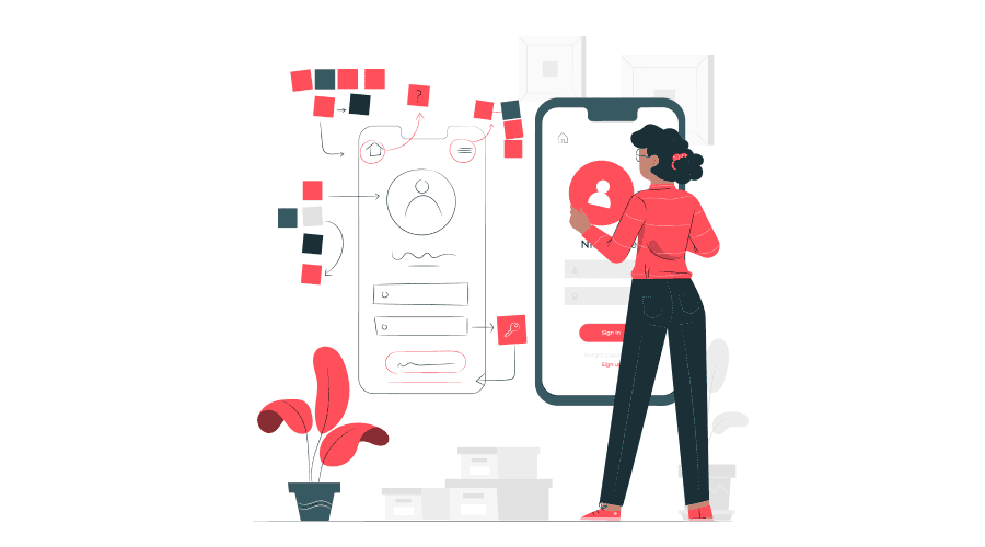
1. User-centered design
User-centered design is an absolute necessity for creating a beautiful product. Understanding the user should be the first step of the design process and should guide the rest. Before building the wireframe, prototype, or initial sketch, the design team should understand who will use the product, where they're from, what they do, their age, and what they want from the product.
The team should understand the users' pain points and what they struggle with and design the product to solve them.
Once the team has this information, all design decisions should stem from it. Everything from the colors and icons to the UX design should be centered around the user.
This principle also emphasizes the importance of user testing. Even after comprehensive user research, the product may not offer the best experience for users. Without extensive testing, the development team cannot know what the user wants because, as Steve Jobs said, "A lot of times, people don't know what they want until you show it to them."
2. Hierarchy
Hierarchy is essential to how the user is guided through a product. It plays a massive role in determining how users experience the product and learn how to use its features. Hierarchy is also a tool for designers to dictate user behavior and interaction.
There are two aspects to hierarchy in design: information architecture and visual hierarchy.
Information architecture is about how the product reveals itself to the user or shares information. It's about organizing content within a product so that users can quickly find the information they want while presenting it in the proper context.
For instance, when someone first starts using digital drawing software, they may just want a pencil tool and a canvas. But as they gain more experience, they’d like more powerful tools. Similarly, when someone opens a social media platform, they generally don't want to know about the founders or data storage policies.
Visual hierarchy is how designers pull users' attention to what is important. For example, if a designer wants the user to find something quickly, they’ll make the elements prominent or give them a bright color. Visual hierarchy defines how users' attention travels from element to element.
Typography, size and color of elements, how the designs are aligned, white space, and other aspects are carefully decided to drive this attention.
3. Accessibility
Accessibility is often a design principle that is ignored or treated like a feature. It is about allowing a more diverse range of people to use your product and gain value from it. Unfortunately, many product development teams ignore accessibility concerns.
But there are tangible benefits to making your product accessible to more users. For starters, more users translate to a higher ROI on the product.
Accessible design makes products easier to use for everyone. This is known as the curbside effect. For example, while closed captions were introduced for people with hearing disabilities, they allowed everyone to watch movies or videos in crowded environments.
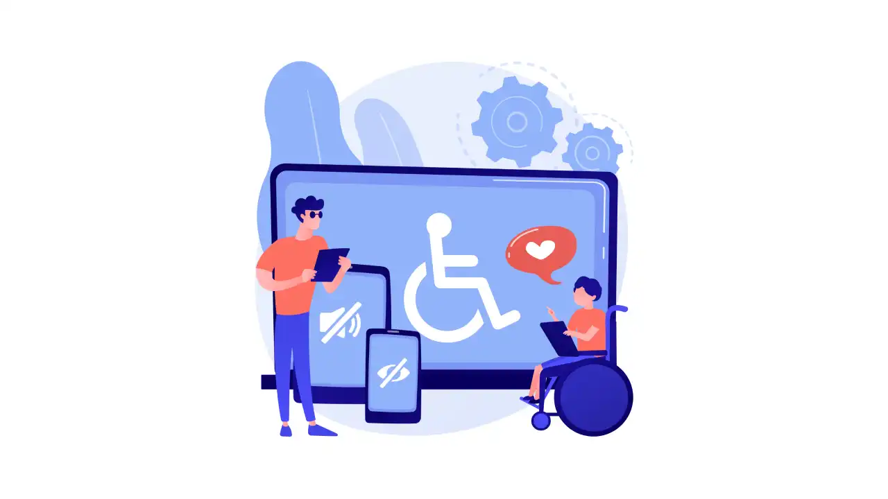
Many governments have also mandated accessible design through legislation. For instance, the Americans with Disabilities Act has set standards for making public spaces and buildings accessible.
To make products accessible, ensure that a diverse range of users can interact meaningfully with the product, including people with hearing and visual impairments. When designing web apps, design teams can use WCAG standards that has very detailed specifications. The standards include using high-contrast colors and readable typography and offering specifications for audio, video, and other media.
4. The right amount of control for the user
All products must offer users the right amount of control. The product shouldn't make the user feel like they are being forced to do something. Users should be allowed to make mistakes, and the design shouldn't punish them for it.
For instance, when a user is buying something through an e-commerce website, they should be able to abandon their plans and go back at any point. Even if they have selected all the products or filled in their address, they should be able to make changes without having to close the app or start the process all over again.
In another case, if a photographer accidentally edits out a part of the subject's hair, they should be able to undo it.
When designing a product, ensure users can back out of their decisions at any point. Ensure users have undo, redo, cancel, and go back buttons wherever applicable.
At the same time, it's also important not to force users to make too many decisions. Hick's law, commonly used in UX design, states that "the time it takes to make a decision increases with the number and complexity of the choices." Another factor is that they're also more likely to regret their choice. Imagine you're creating a product that lets users create custom avatars for social media. The more options you offer, the more time it will take them, and the more likely they're to abandon the process.
We can take lessons from camera apps and photo editing software to solve this problem. These products lay all the essential and simple features right up front. Most camera apps let users click a picture with a tap or two. But if users want to adjust the lighting or focus or turn off the flash, they can do so by going through the menus. By keeping these toggles out of sight, they don't overwhelm users.
5. Jakob's law
Jakob's law states that "users prefer your site to work the same way as all the other sites they already know." It is mostly about web design, but it can also be applied to other interfaces and products.
The law warns designers who want to go overboard with creativity on their products. It demands development teams to keep the user at the center and forces them to think if they should go with a completely new interface or something users are familiar with.
Jakob's law is the reason why most e-commerce websites look similar or why most web pages have a similar structure. But the law is not meant to curb innovation. It just means don’t reinvent the wheel unless it provides enough value to the users and then test it comprehensively.
6. Usability
The simplest explanation of usability is that the user must be able to use the product easily with minimal friction and access all features with the least effort. Usability has many aspects.
Users should be able to learn how to use the product; they should have a smooth learning curve and shouldn’t have to go through 100-page user manuals to make the first move. Consistency across the interface plays a huge role here.
Products should also allow users to get value from them without compromising productivity. They should get enough value for the time and effort they put into it. The product should be designed to reduce errors, and if users do make mistakes, they should be able to recover quickly from them.
7. Doherty threshold
Doherty Threshold is an indicator of the patience and attention levels of humans. The principle is that the users want a response time of less than 400ms when interacting with software or a computer. Once they have taken action, they want to see the computer respond to it within 400 milliseconds.
Doherty Threshold is why designers use progress bars when an app is processing information. These bars are not often an accurate indicator of the time left, but their presence keeps the user engaged.
Designers can also use animations and other activities to keep the user engaged. But ideally, there shouldn't be a delay longer than 400ms.
8. Less is more
The idea of this principle is to reduce the cognitive load for users. The product or its functionalities should occupy as little mental space as it has to; users shouldn't have to spend much time understanding things or evaluating the different choices.
In practice, this means that the product must simplify choices. The product should not overwhelm users or make them keep too many things in their heads.
Products should also use clear, precise language as UX copy. The user shouldn't have to read ten-point guidelines to use a minor feature.
9. Context
When designing a product, the team should take the context in which it will be used. This includes the industry where it will be used, the different demographics, where the user may be while using it, how the user may think when using it, and other contextual information.
For instance, if designing the interface for industrial equipment, you should consider that the area may be noisy and refrain from relying on audio alerts or alarms alone. In a payment app, the user should be able to complete transactions without navigating through many menus.
10. Give your interface a personality
The idea here is that humans generally don't like engaging with a robot or a machine. Users should be able to connect with the product and feel as if they're interacting with another human.
This is optional but will make your product or solution more engaging. For example, the Duolingo Owl makes it feel like some person (or an animal) is talking to the user instead of an app.
Design Intuitive UI and UX with Imaginovation
Imaginovation is a skilled and experienced team of designers and developers. We've been working with SMEs, and large corporations to develop products and solutions and have delivered exceptional results for them.
Our UI UX design process keeps users at the center and bases our solutions on proven design principles and processes.
Reach out to us, and let's build something extraordinary together.
Let's talk.


