National Technical Honor Society
About National Technical Honor Society
National Technical Honor Society
The Solution
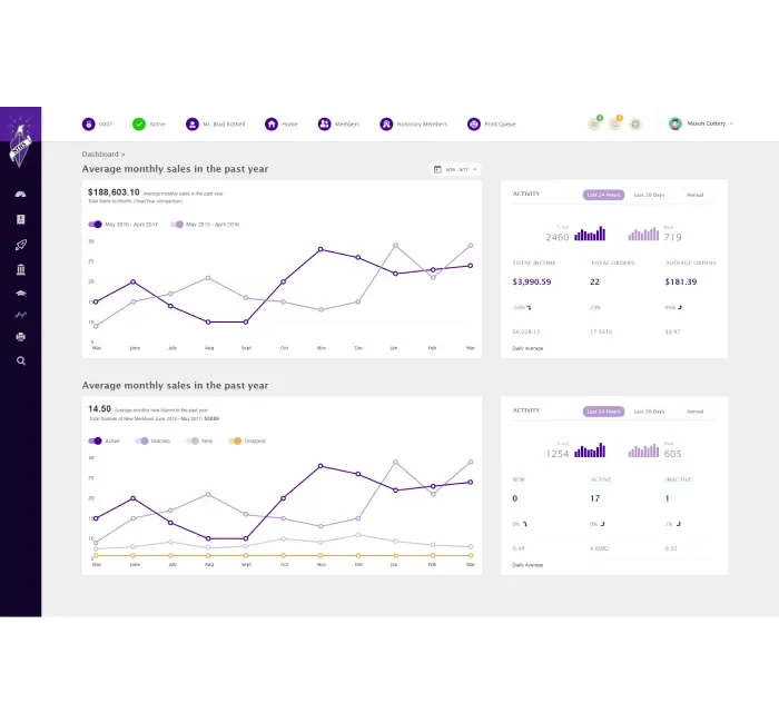
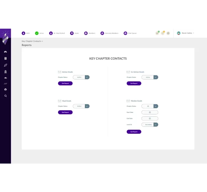
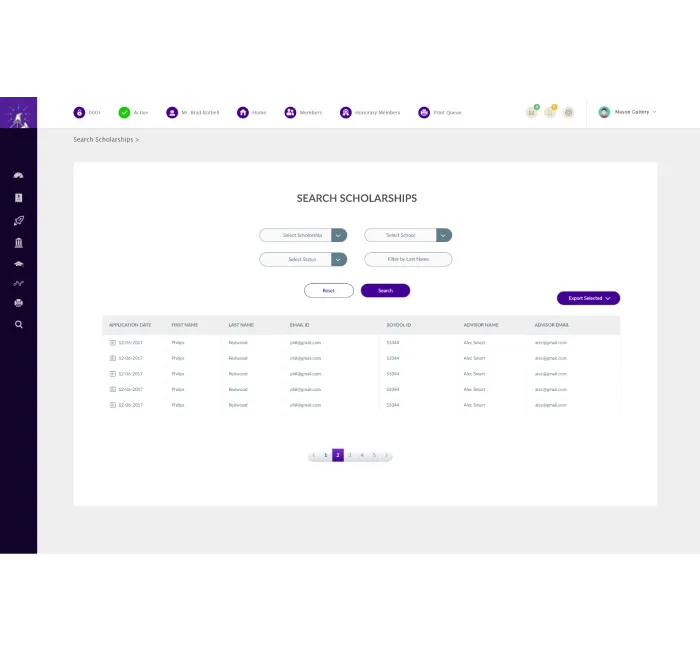
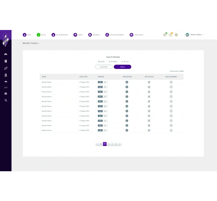
We provided a sleek user interface focused primarily on performance. We used AngularJS to create a single-page application that had sharp navigation and swift page load speeds. We served the data over a REST API via NodeJS on the backend, which integrated with PostgreSQL as our database. The result was a system with a complete suite of features and interactive components.


Our Strategy
Following a series of initial meetings, we knew we had our work cut out for us with NHTS, in a good way. It was clear early on that active collaboration with the project stakeholders during the design stages would be key to fleshing out their vision and bringing the idea to life. Here’s how we did it:
(Phase 1)
Discovery
Our goal in the discovery for this system redesign was to first verify that all of the moving pieces were in the correct place.
- We spent a great deal of time learning what NHTS’s vision for the new system was, the challenges, opportunities, and how we could create the perfect platform.
(Phase 2)
Plan the User Journey
With a crystal-clear understanding of the NHTS’s vision, we started planning out what the user experience would look like.
- The focus of this user journey was simplicity – with a great deal of elegance.
- This involved creating a process that was overly streamlined where users could find exactly what they needed.
(Phase 3)
Wireframes
We created wireframes and started to illustrate what the app’s UI would look like.
- We provided a great taste of how the UX would feel, how the branding would shine, and everything that could be expected in the new web app.
(Phase 4)
Development
The next phase was to develop the workflows within the app.
- Following the Agile development process, we started to turn the nuts and bolts of the vision into a reality.
- Our front-end developers built out the client-facing aspects of the application.
- The backend was created to ensure the interaction between the user and the server was a streamlined as possible.
(Phase 5)
Test, Test, and Optimize
We wanted to make sure the usability of the new interface was crisp and easy every step of the way.
- This involved a great deal of testing, optimizing, testing, and optimizing some more to ensure EVERYTHING was flawless.
- Once NHTS was happy with the project, we began the steps to rolling it out.
The Results
The newly developed web application provided NTHS with a robust platform that effectively connects with its members. The intuitive design and optimized performance have enhanced user engagement, allowing members to access resources and information efficiently. This digital transformation supports NTHS's mission to honor and empower students and educators in career and technical education.
Elegant and Intuitive User Interface
Optimized Performance for Large Data Sets
"Imaginovation not only met but exceeded our expectations, helping us transform our operations into a seamless digital experience."
"What impressed me the most was their attention to detail. They didn't just focus on getting the job done; they ensured that it was user-friendly, visually appealing, and optimized for performance."

“Their expertise and technical knowledge allow them to deliver highly specified solutions.”
