
Get a personalized assessment of your operational efficiency and accelerate growth for your business.
C-Suite leaders love business dashboards. You get a single-screen snapshot of your operational processes, key performance indicators (KPIs), and strategic metrics in a custom business dashboard. It’s a delight to see all the critical elements in a single window.
A custom business dashboard is visually appealing and intuitive. But, most importantly they accelerate the decision-making process in your company. They allow decision-makers to absorb the torrents of data critical to the company’s success in nanoseconds.
Dashboards improve the quality of decisions, therefore, modern-day businesses are investing in custom business dashboard development.
You may choose to opt for custom business dashboard development that’s a perfect fit for your organizational needs. How?
In this blog, we will look at custom business dashboard development and also some exceptional business dashboard examples. Let’s dive in!
How Can Custom Business Dashboards Accelerate Decision-Making?
Not long ago, decision making meant opening several spreadsheets, checking-and-filtering emails, and placing sticky notes. But, it’s time to ditch the clunky Excel sheets and opt for optimal solutions.
Let’s look at some factors that help in improving business decision making via dashboards.
1. The Visual Power—Visualizing Data At-A-Glance
You must be familiar with your car’s dashboard. It’s such an integral part of the vehicle’s operation. The swift view of data helps navigate easily and is comprehensible even when you are driving at immense speed.
What do you like about the car dashboard? Yes, you’re right—the panel has clear symbols, and the size and simplicity are just right.
When you are running your organization, decisions are a part of your everyday work. Business dashboards are analogous to your car’s dashboard. They perform the same functionality.
Dashboards are analytical tools that help to visualize data across industries. With trendy UI/UX, you get an uncluttered picture of critical activities at your fingertips. The result—you can quickly work on the crucial metrics and KPIs for better decisions and situational understanding.
You can see the data depicted in icons, colors, charts, or other cues. Now, it’s uncomplicated for you to view your business, team, or project’s performance.
Dashboards reflect data that help you navigate your way through everyday tasks seamlessly. When you get to a quick view of essential data, it is easy to spot deviations and take quick corrective measures. The best part—you can also choose to make a custom business dashboard instead of an off-the-shelf solution.
Why? It gives you the control to decide the data placement on the single-screen interface.
2. The Balancing Act—Ingraining Accountability
When it comes to results, you need strict accountability to deliver the results that your business needs*.* How do you make sure that you are reaching or failing to achieve the goals? Custom business dashboards can help define the success you are looking at and give you a clear picture.
It is a good practice to establish clear expectations, and guide the teams and individuals towards getting your desired outcomes. Transparency will help everyone in your organization see the KPIs in real-time every day. It will be a significant input to know if they are going in the right direction.
You will also be encouraging a healthy culture in your organization as you work on ingraining accountability.
3. The Bias Facet—Improving Analytics Culture
Bias is an intrinsic part of analytics, and even Gartner acknowledges it (Source). The BI dashboard development process may have some subtle elements of bias. How do you deal with bias?
You can use provocative thinking in understanding and removing preferences. You must remember that dashboards aren’t magic cure-alls. It is significant to look at data, keeping in mind the limits of the tools and your perception.
When you take the right steps toward improving your analytics culture, you will find the benefits coming back in multiples. The more you manage biases with precision, the more you get unbiased views. The result—you can make reliable decisions.
Keeping these facts in mind, when you implement a dashboard, you can design a visual-noise-free and straightforward tool. Here’s a quick set of features:
Features to Consider When Creating a Data Dashboard
- You should be able to analyze data, and also filter and sort it
- Make sure it has the drag-and-drop functionality
- Keep it multilingual
- Keep drillable graphical elements, including charts, tables, stats, etc.
- Select colors—keeping culture and color blindness in mind
As you blend some of the must-have features, your single-screen user interface (aka dashboard) is ready to help better decision-making. Executive dashboards improve the organizational culture, eliminating manual errors.
You can help in a big way in the custom business dashboard development process with your insights.
Types of Business Dashboards
1. Analytics Dashboards
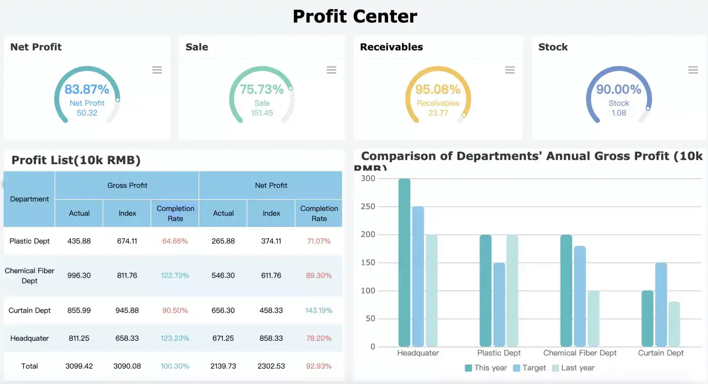
Image 2: Analytics Dashboard Example | Image Source
Picture this—you want to have a visual representation of revenue growth and profit margins. You can use analytics dashboards for such in-depth data insights.
The interfaces are useful for consolidating data and help you analyze historical trends. You can get some critical ideas and drill down (or compare) into some of the performance metrics and KPIs.
2. Strategic Dashboards
When you want to monitor the status of KPIs, you would typically use the strategic dashboard. Business owners, C-Suite executives, and other heads use it to offer a quick overview of organizational or departmental health.
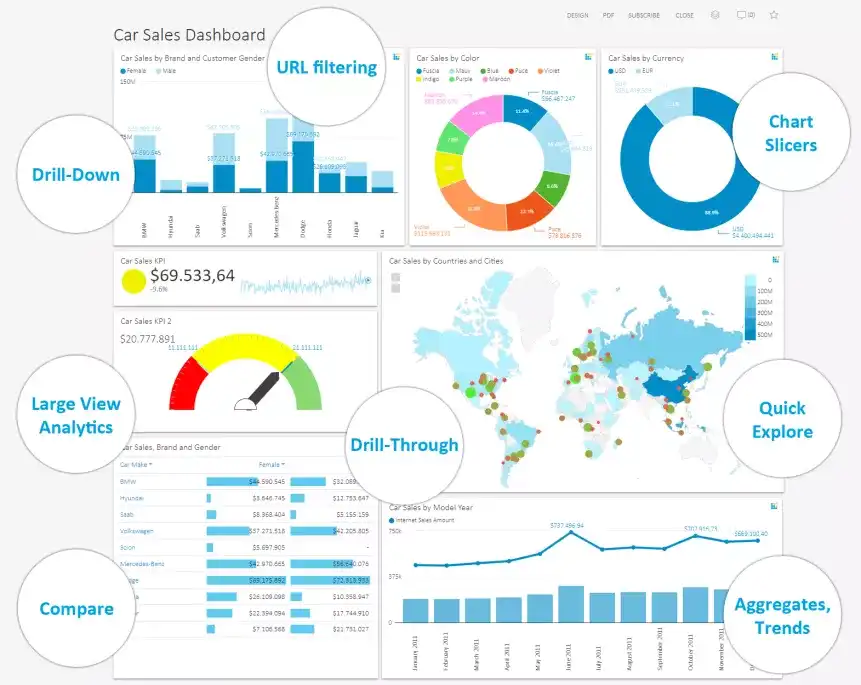
Image 3: Strategic Dashboard Example | Image Source
You may also find some explanatory text that explains vital trends and recommendations for actions to be taken. The tool is excellent for track total expenses, revenue, conversion rate, customer acquisition cost (CAC), social metrics, and other significant metrics.
The tool plays a pivotal role in helping you achieve your long-term goals. If you want to get some incredible results, you may choose to construct powerful dashboards with the help of expert web development companies, such as Imaginovation.
You can enjoy the journey of creating a valuable tool with the help of established industry professionals. The experts can walk you through every stage from defining your needs to successful implementation.
3. Operational Dashboards
When you want critical insights into your business processes, and how individuals or teams are currently performing—operational dashboards can help. It is a useful tool to get real-time insights into tasks or company objectives.
The tool also empowers you to make informed decisions and knowledge sharing. The operational dashboards are typically viewed many times throughout the day. It can also help you track progress toward a specific target.
Business Dashboard Development: Best Practices
The dashboard creation process is fascinating. You have the power to make it more meaningful for the user. How? When users in your organization find it a go-to tool, you know you’ve placed the narrative correctly.
Let’s look at some tips and best practices to create valuable dashboard software.
1. Defining the objective and target audience
This is one of the most important steps in dashboard development. You can sit down with your team and find out:
- The goal
- Target users
- Daily tasks that users will perform, you can get super-specific if you want
- The KPIs that can help the user’s role
- How are they checking the KPIs in real-time?
You would prefer to have an exhaustive list trying to chalk out all possible details. But, the objective of this exercise is to get micro-details. The data will help to understand the audience better and offer solutions that are a perfect fit.
2. Selecting the right charts
It’s all about presenting data correctly! You may have all the data, but if you select the wrong chart types, things can go south.
It is essential to quickly look at the chart types and choose the ones that serve the purpose. Here are some quick tips.
Table 1: Common Types of Charts with Features
| \\\\\\*\\\\\\*Chart Type\\\\\\*\\\\\\* | \\\\\\*\\\\\\*Features\\\\\\*\\\\\\* | \\\\\\*\\\\\\*When to Use\\\\\\*\\\\\\* |
| Bar Charts | Simple and effective | For comparisons and trends |
| Pie Charts | Quick, intuitive understanding of information | To represent proportions of a whole, and when a total of numbers is 100% |
| Line Charts | Easy to understand | To show developments over time, and identify trends |
| Gauges | Handy to show whether data is within an acceptable range or not | For highlighting a specific KPI that needs attention |
| Area Charts | Emphasizes the magnitude of data | To show multiple data series with part to whole relationships, or for individual series representing a physically countable set |
| Tables | Easily groups or segments of data | For detailed information |
You can see that choosing the right chart can make a massive difference in deciphering information.
3. Adopting color theory
The splash of colors on your dashboard can be impressive. However, it is good to note that around 8% of men and 0.5% of women are colorblind. You must be sensitive and choose the best colors for your target readers.
Remember, that tool’s objective is not about creating a visual impact, and business outcomes count!
4. Working on mobile-optimization
As a business owner, you know that you need to access information 24/7. You would prefer to create dashboard designs, optimizing them across devices. The tool will be handier when you can access it quickly and seamlessly.
5. Creating a balanced perspective
When you look at your dashboard, it must tell you a compelling story. Any story that has balanced protagonists is easy to remember and helps with a better response. Your data is the protagonist on your dashboard.
You may choose to pick the best visualizations for your dashboard, giving a clear-cut snapshot of trends, insights, and future outcomes. You would prefer to have a balanced mix of in-depth insights that can empower your business to succeed.
It may be a big step to opt for the data dashboard development process. It’s no doubt that you must consider transcending towards creating a useful tool—it will help to expedite making decisions. Let’s look at some more benefits.
Benefits of Data Dashboards
1. Accelerating Decision-making
It is best to reiterate! Dashboards can help with remarkable insights. You can analyze data aptly, identifying actionable areas.
Did we forget to mention?
You also save lots of time sifting through massive amounts of data. Remember opening Excel sheets! Yes, that’s right—you don’t need to do that anymore. The structuring of data visually can help to absorb information quickly.
As you work towards developing the analytics culture, you can promptly understand gaps or biases, and fix them.
2. Making the Tool Interactive
What’s the best part about dashboards? They aren’t static! You can choose to drill down or filter and make changes.
The interactive nature of dashboards helps to engage with the information better. You can get all sides of the story correctly. It is also powerful to view the data from different perspectives, and interactivity helps.
3. Improved Forecasting
You can get more significant insights and predict future demand more accurately.
Using historical information, you can plan for fluctuations in the next business cycle. You can also set measurable goals and deliverables to gain a competitive advantage.
4. Enhanced Visibility
BI dashboards offer more visibility with information. It feels great to empower your business with the tool to respond better to changing market conditions.
5. Increased Competitive Advantage
When you know your performance within the market, you can plan to position yourself more strategically. The data dashboards can help to monitor seasonal changes, anticipate customer needs, and more. As a leader, you can articulate a strategy, a roadmap, and allocate resources for measurable ROI.
With so many benefits, you and your organization can start planning to create a thriving data culture.
Business Dashboard Examples
Let’s look at some cool dashboards. It is always a good idea to look at the latest trends and best dashboard design examples. The inputs can help you to streamline your efforts.
1. Marketing KPI Dashboard
Marketing dashboards offer a bird’s eye view of marketing analytics, KPIs, and metrics. Your marketing managers and executives will love to reach out to new prospects using the insights.
It is also easy to get detailed insights on customer lifetime value, cost per acquisition, ROI, and more. When you track the right marketing KPIs, you can also fine-tune various strategies and budgets.
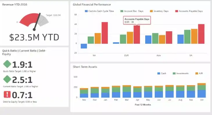
Image 4: Marketing KPI Dashboard Example | Image Source
Important Marketing KPIs
- Sales Revenue
- Customer Lifetime Value (CLTV)
- Cost Per Lead
- Lead-to-Customer Ratio
- New Contact Rate
- Inbound Marketing ROI
- Social Media Traffic and Organic Traffic
2. Financial Performance Dashboard
The fastest way to find whether your organization’s business performance is on track is to check the financial KPI dashboard.
The financial metrics are a good indicator of how when your company is doing. The tool is an excellent way to track the fiscal health of your business.
Image 5: Financial Performance Dashboard Example
Important Financial Performance KPIs
- Operating Cash Flow (OCF)
- Return on Assets
- Quick Ratio
- Burn Rate
- Return on Equity
- Debt-Equity Ratio
- Working Capital
3. Web Analytics Dashboard
Picture this—you want to track metrics like visitors, online conversions, page views, and more. The web analytics dashboard allows you to monitor your website performance effectively.
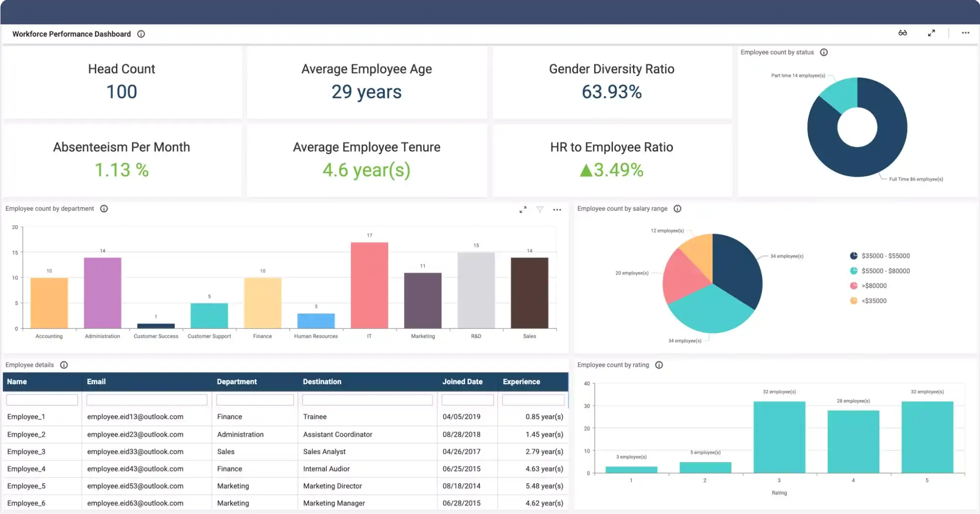
Image 6: Web Analytics Dashboard Example Image Source
Important Web Analytics KPIs
- Sessions and Users
- Bounce Rate
- Goal Conversion Rates
- Landing Page Conversion Rates
- Organic vs. Paid Sessions
- Time on Page
4. Employee Performance Dashboard
Another critical aspect is to look at the visual feedback on the performance of employees. Ideal for HR managers, the employee performance dashboard gives insights on metric types, including absenteeism, overtime hours per week, and quarterly performance rating.
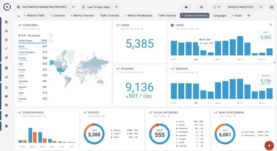
Image 7: Employee Performance Dashboard Example | Image Source
Important Employee Performance KPIs
- Absenteeism Rate
- Average Tenure
- Overtime Hours
- Cost per Hire
- Employee Productivity
- Training Costs
- Hiring Process Satisfaction Rate
5. SaaS Dashboard
The dashboard helps to monitor and collate data directly related to online software distribution. You can track SaaS metrics for each team in your company. The tool is also useful in organizing metrics from sales, finance, marketing, support, and other groups. The at-a-glance view of the business is laser-focused to help your business grow fast.
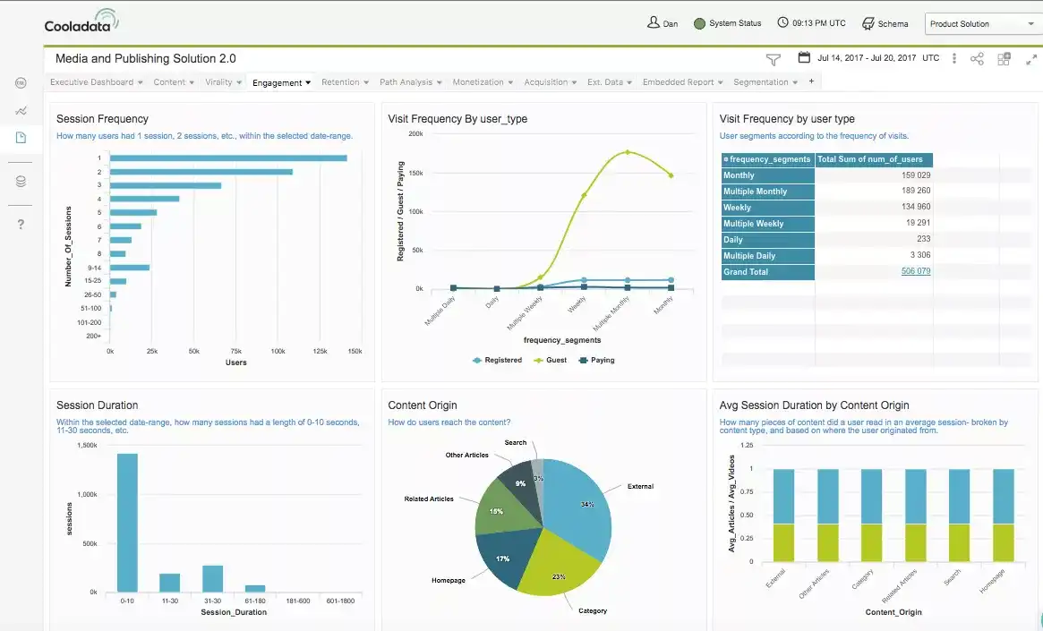
Image 8: SaaS Dashboard Example | Image Source
Important SaaS KPIs
- Recurring revenue
- Lifetime customer value
- Cost to acquire customers
- Net Retention
You will find some of the most refreshing business dashboard examples. The critical question is to look within your organization and identify your needs.
You can opt for custom business dashboard development that assures you to achieve your business goals. As a key decision-maker, it’s time to empower your business and make informed decisions. How? The one-word answer—BI dashboards.
Create a Valuable Custom Business Dashboard with Imaginovation
Whether it’s an off-the-shelf dashboard solution or a custom data dashboard, it’s time you create a successful tool for your business. Get in touch with us to know how our team at Imaginovation can help you succeed with custom business dashboards.
We have designed an in-depth Discovery process where we perform research on your ideas and help you turn them into a digital reality. Let’s talk.