Get a personalized assessment of your operational efficiency and accelerate growth for your business.
It’s going to be an exciting decade for web designers and enterprise web design companies with myriad web design trends emerging in 2025. There’s a lot to explore and express creativity in the design field right now.
Picture this: you have a brilliantly designed website that gives you goosebumps every time it loads plus it also gives you a high ROI, and a competitive edge to stay ahead of the competition. Neat isn’t it?
For designers, that’s not just a vivid imagination—but a challenging reality—that’s what they creatively strive for day in and day out, crafting new visual brands that stand out.
The question is: do you need to look at the trending designs? Doesn’t it affect the entire psyche and creativity process?
Designers are not fickle beasts who get overawed by UX trends. It’s like entering Dante’s extraordinary ring with new web design techniques and put in the intelligent effort and come out with products that are the most relevant for the current era.
The trick then is to know what’s culturally relevant at the moment—if you can genuinely empathize with users, understand what they love or hate, then you’ll be more vigilant to blend it in the creative processes—and that’s important.
It is significant to be aware of what’s happening in the arena to get that competitive edge. With rapidly changing styles and trends, crafting new techniques could be a creative challenge, and designers may be under constant pressure to keep up with the times.
However, it is under tremendous pressure that the best designs are ideated and shaped. In essence, it is significant to look at the trending web designs. So, where to start?
In this post, we will look at some exciting modern web design trends in 2025 and web design techniques, getting you that competitive edge. Let’s dive in.
Modern Web Design Trends and Techniques in 2025
Crafting quality designs are the result of genuine effort. Designers must always remind themselves that their expressions of creativity must help users understand products better.
Knowing the latest styles just helps to discern what they are contending against, and maintain a creative balance while ideating. Let’s look at some fresh web design trends with examples.
1. Expressing with Digital Illustrations—Some Flat and Some Not-So-Flat
Working with illustrations can be fun and can turn an average website into something stunning. It’s a powerful way to communicate your brand message through simple visual narratives.
Designing characters that ring in warmth and friendliness are inspiring and fresh.
When Alice Lee crafted a voice for Slack, she referenced Mary Blair’s legendary body of visual development at Disney and the minimalist and compositional balance of Charley Harper’s works.
She then fused the abundant references into tech enterprise illustrations that made Slack’s illustration voice warm, sophisticated, and “Slack-y.” The stylized works of Alice Lee instantly had a cult-ish effect, and it is one trend to look out for in 2025.
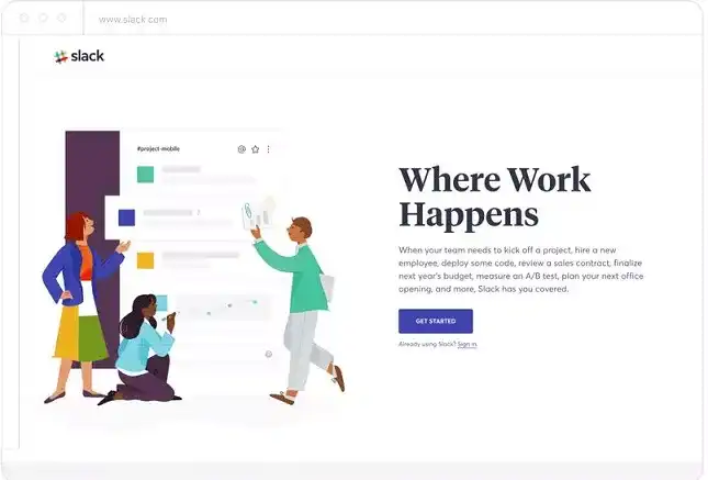
Slack Digital Illustrations | Image Source
Another brilliant example is the e-commerce website Etsy that creates a memorable experience with its focus on vintage items and supplies and bold illustrations with funny characters.
Flat and 3D illustrations are a great way to deliver your brand message across, and cloud infrastructure provider Digital Ocean uses both the techniques.
They use 3D illustrations for their homepage and flat illustrations with vibrant colors for their blogs—and both web design techniques give you a more considerable exploration base.

3D Illustrations—Digital Ocean | Image Source
When it comes to illustrations, you cannot miss out checking Dropbox, where you can find more navigation options that contribute to helping visitors find what they want. An ingenious facet about Dropbox elements is that users can quickly establish a connection with the illustrations.
Another exciting approach brought in by Dropbox is collaborating with external illustrators. So the strengths and flair of Zach Graham, Fanny Luor, Brandon Land, and Dominic Flask gives you an excellent illustration base and opens up new possibilities in work.
So collaboration will be the key in the web design future—and you may choose to talk to an experienced digital agency such as Imagionavtion to help you with intelligent web designs.
2. Creating Inclusive and Accessible Designs
Imagine if over a billion people could not access your website, or even after visiting it, are unable to navigate through or understand it. In reality, the World Bank statistics show over 1 billion people with disabilities in the world. Disabilities such as auditory, cognitive, neurological, physical, speech, and visual affect access to the web.
How can you help? As David Caldwell says, “Good [accessible] design happens when you view your [design] from many different perspectives, or lenses.” So, you can create inclusive and accessible designs that are functional and can accommodate as many individuals as possible.
A good example is Trello that added a colorblind-friendly mode. It’s beneficial, and it does not impact the overall look and feel of the product.
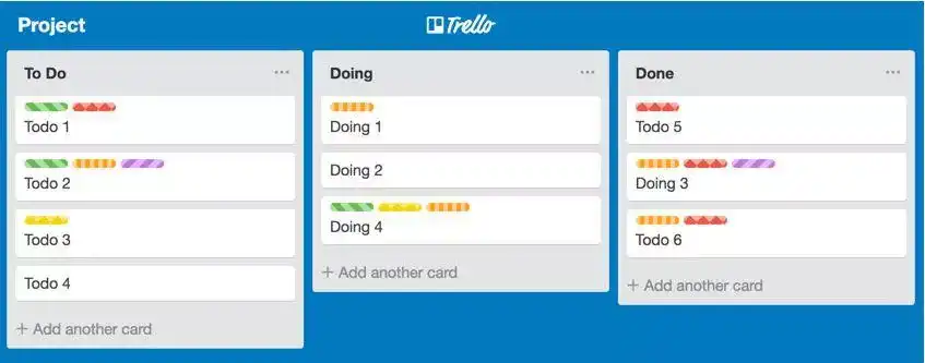
Trello—Incorporating Colorblind-Friendly Mode | Image Source
Another brilliant example is Facebook, which extends the keyboard navigation menu allowing users to visit specific sections of the site. The feature facilitates users to speedily interact with the page and the content that they want.
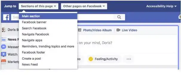
Facebook—Incorporating Keyboard Navigation Menu | Image Source
Let’s look at some steps that can help with designing a basic level of accessibility.
Table 1. Designing to Achieve Basic Level of Accessibility
| \\\\\\\\\\\*\\\\\\\\\\\*Design Approach\\\\\\\\\\\*\\\\\\\\\\\* | \\\\\\\\\\\*\\\\\\\\\\\*How Can It Help?\\\\\\\\\\\*\\\\\\\\\\\* |
| Clear visual layout and colors with good contrast | - Clear designs help users naturally navigate - Color contrast is critical to digital accessibility |
| Keeping a minimalistic design approach | - Overcrowding the screen makes navigation difficult, minimalistic designs, on the other hand, facilitate navigation |
| Meaningful anchor text for links | - Keep anchor text for links concise and understandable - Place useful explanation of the link into the anchor text |
| Call-to-action (CTA) buttons and navigation using a keyboard | - Craft CTA buttons that are easy to spot—prefer designing large buttons - Navigation using a keyboard helps users to visit a specific section of the website without hassles |
| Videos with captions and transcripts for audio | - Users with a hearing loss can find captions helpful - Providing transcripts and aligning with the audio can benefit auditory impaired persons |
In 2025 and beyond, it will be exciting to create inclusive and accessible designs, ensuring that more users can have a meaningful digital journey.
3. Splashing Vibrant Colors
Colors are one of the most powerful tools in a designer’s kit.
Don’t be afraid to mix tones and hues and come up with eye-catching, vivid, and modern solutions. French creative web studio Waaark uses vibrant and elegant colors, creating a warm look and feel.
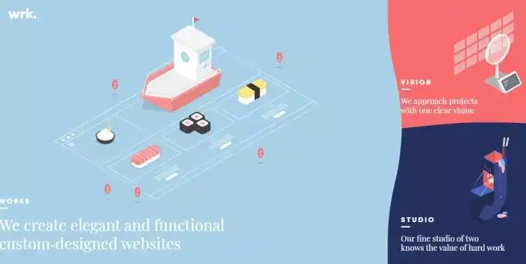
Waark Homepage | Image Source
Colors are one of the most effective ways to get that eye-catchy look and feel. You can play with a blend of colors for background and foreground and create unique design experiences.
4. Split Screen Designs
Split-screen design is another exciting web design trend that can help to showcase different content that is equally engaging.
The design enables you to create attractive, well-organized, and informative websites. The significant elements of split-screen layouts include:
- Vibrant colors and use of contrast
- Clear typography
- Subtle transitions or interactive elements
- Use of white space
Bose uses a two-way split to include five segments of products. Users can experience dynamic animations as they hover over a product—and that’s cool.
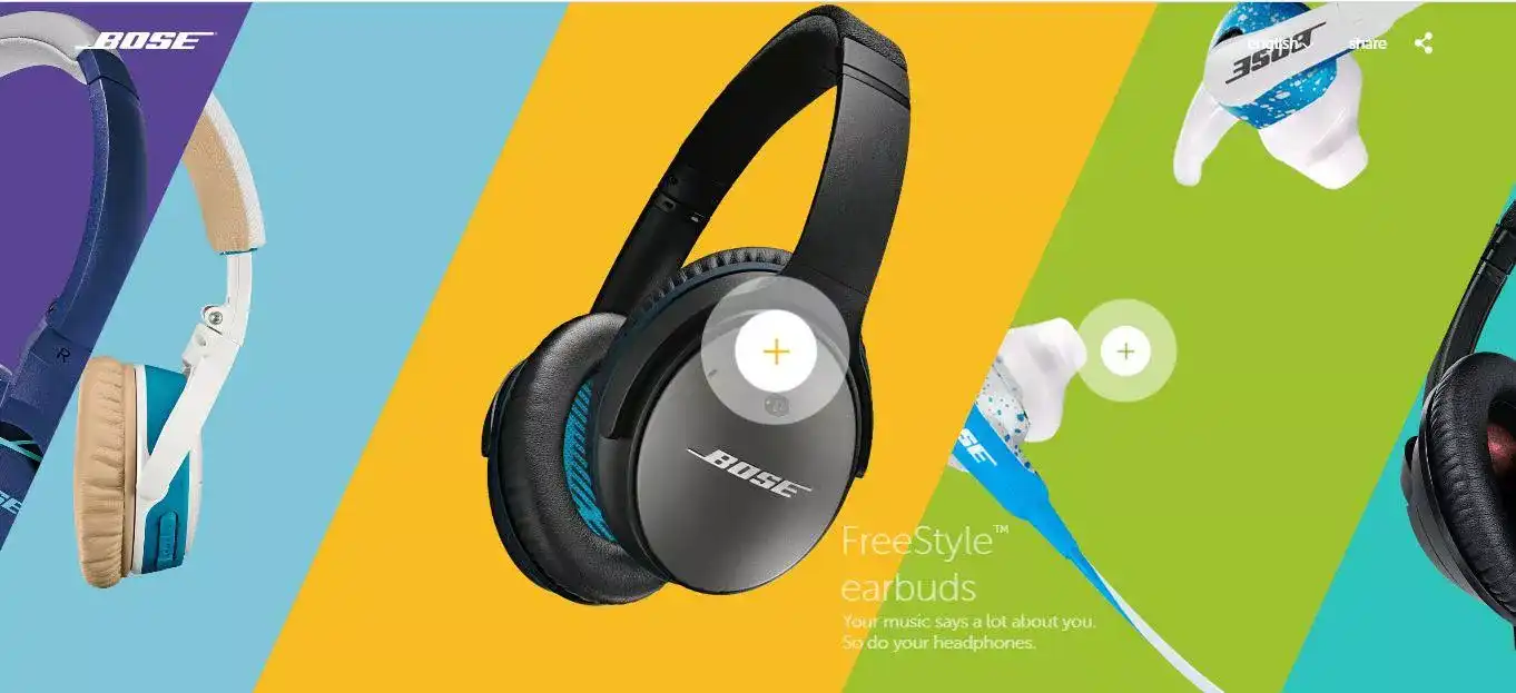
Bose Homepage Image Source
Another split-screen design example—Engine Themes’s homepage uses the 2-color split design—it’s eye-catching and brings in clarity to the page content.
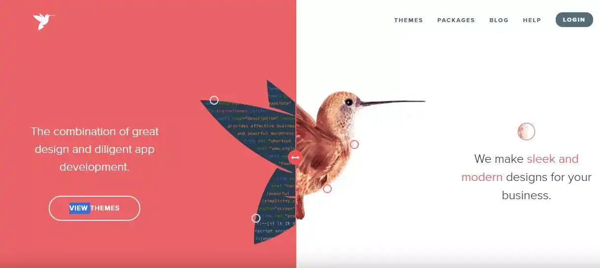
Engine Theme Homepage | Image Source
The design technique is quite simple to incorporate and works well when you need to deliver separate messages that are equally important. The method also works well on mobile. So, enjoy split-screening!
5. Showcasing Geometric Shapes
Impressive squares, circles, rhombus, and hexagons—we’re talking of geometric shapes—another web design trend that you can incorporate in 2025.
Here’s a sneak peek on what you can do with geometric shapes.
Table 2: Putting Geometric Shapes in Practice
| \\\\\\\\\\\*\\\\\\\\\\\*What you can do with geometric shapes\\\\\\\\\\\*\\\\\\\\\\\* | \\\\\\\\\\\*\\\\\\\\\\\*Explanation\\\\\\\\\\\*\\\\\\\\\\\* |
| Visual effect | You can use myriad shapes to beautify the aesthetics of a webpage. |
| Navigation | You can use shapes such as buttons, which links to a different page on the website. |
| Framing | You can use shapes that work as containers to significant pieces of content such as text or images. |
Let’s look at some geometric web design trends examples—the website from visual artist Isaac Katz is not only breathtaking, but also subtle, using geometric icons for navigation, and asymmetrical graphics that serve as material backdrops.
Glamuzina Architects has been making waves in the New Zealand architectural space, and their homepage is minimalistic, featured with a pattern of dots that resembles a grid. The mathematical design helps achieve a more organized look, and the impact is terrific.
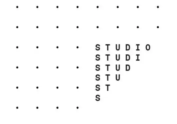
Glamuzina Architects Homepage | Image Source
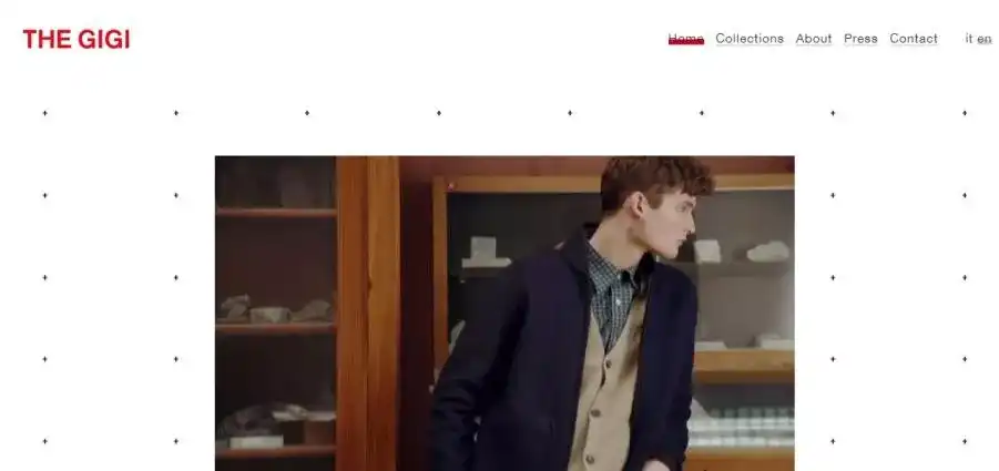
Now let’s look at our next geometric web design example. A remarkable geometrical feat resonates with the website for The Gigi.
The designers have beautifully captured the creative soul of the brand on its homepage, which is a simple background pattern made of little black crosses (or pluses) on a white background. The dynamic design interacts with cursor movements and creates a stimulating effect.
6. Designing with Bold Typography
Typography is another brilliant element that can help set the tone, message, and theme of a website.
You can thoughtfully deliberate over the range of typefaces, line lengths, point sizes, kerning, and colors that can curate a brilliant design.
It is interesting to use typography to tell your brand story, which can create an atmosphere that elicits a thoughtful response and establishes brand credibility.
The website for Rijksmuseum rings in a larger-than-life feel with its large letter in a custom typeface spanning the home screen and continuing off-page. The well-optimized home page rotates through incredible photographs of the museum’s contents.

Users can experience wow-moments that can turn heads with a blend of horizontal and vertical texts. The trend creates white space and looks stylistic, breaking up blocks of text.
A good example is a site for a film by Matt Porterfield, “Take What You Can Carry.”
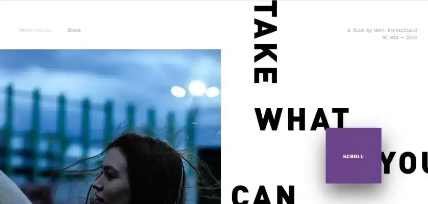
**Matt Porterfield’s Film Website “Take What You Can Carry” **
Another excellent example—Souffl, a European design company, employs bold white text on a black background. It adds character and is eye-catchy.
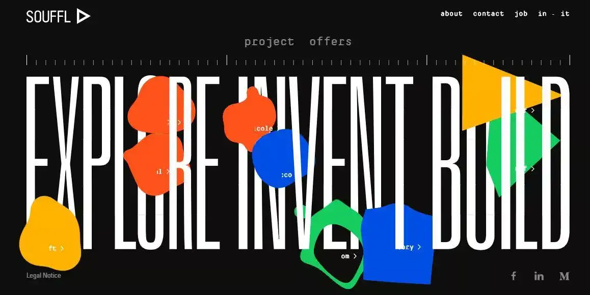
Souffl Homepage | Image Source
7. Outlined Type
Outline fonts are inspiring and can convey a message impressively. It is yet another emerging trend, and you can look forward to creating your brand message using outline typography. The typography effect is elusive and rings in a traditional yet visually appealing letterform.
The website Dot to Dot is eye-catching and compelling.
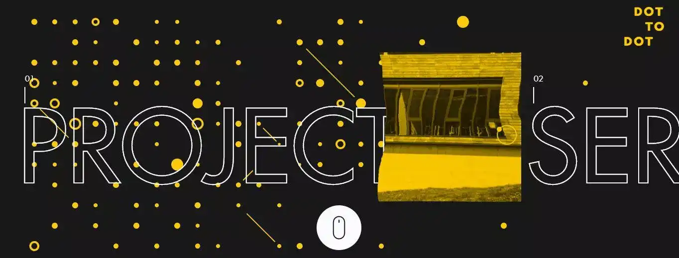
Dot to Dot Homepage | Image Source
Another inspiring example is the homepage of Romain Granai that incorporates outline typography.
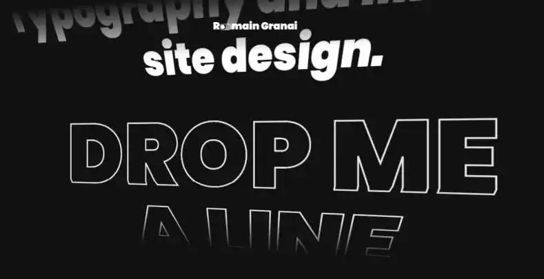
You can look out for the emerging outlined type trend, which is a simple technique to create memorable branding.
8. Brutalism
Get ready for a future that’s a “Brutal” invasion of crazy hovers, system fonts, colossal cursors, and raw designs. The web designs can leave you pretty much uncomfortable—and you can try taming the rugged designs, but it is an ideal opportunity to push yourself and create better designs.
Brutalism is quite relevant in the current era as it captures the lightness, frivolity, and optimism of the younger generation. They also promote creativity, and the aesthetics are bold and can blow-your-mind—literally. Not for the faint-hearted, the designs are exciting and worth exploring.
Now for an excellent brutalist example—The Bad Bonn Kilbi website dons a rugged look and is featured with blinking text menus, large text, and subtle colors.
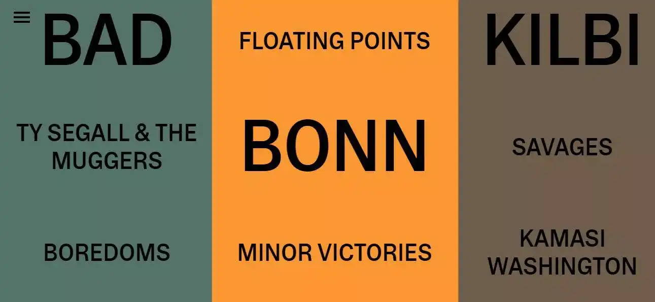
Another brutalist example is that of The Raw Magazine.
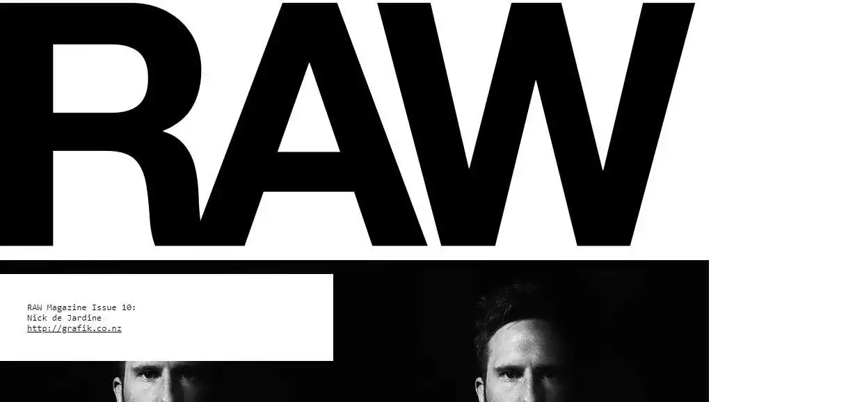
The Raw Magazine Website | Image Source
The brutalist designs reflect a pop-punk culture, and the extreme use of animations can get quite dizzying.
Brutalism as a creative pursuit can be fun, but may not suit the palate of every user—the non-universality of such designs is what makes them so exciting.
9. Floating Elements
In 2025, you can expect web designs that are more fun and can defy gravity. So look out for changing shapes, popping interactive elements, and creative scroll effects.
Greta-Madline is a playful website where interactive 3D objects set the tone. Users can enjoy a unique experience with creative design elements. The design is minimalistic and still very engaging.
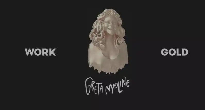
Greta Madline Website | Image Source
You can look out for more designs that are interactive 3D elements that float on the page, creating a playful effect. The designs look cute, and the illustrations are very engaging.
10. Screen-Dominating Text
Dramatic, massive text that dominates the screen will continue to make its way in web designs in 2025. You can witness textual content at the center stage of websites that places content first. If the content is the meat of the site, then you’d want to keep it at the heart of the design, and not trim-it-down.
Check out the Adam Clarke | Color homepage, and you can experience the dominant text, which highlights a powerful brand message.
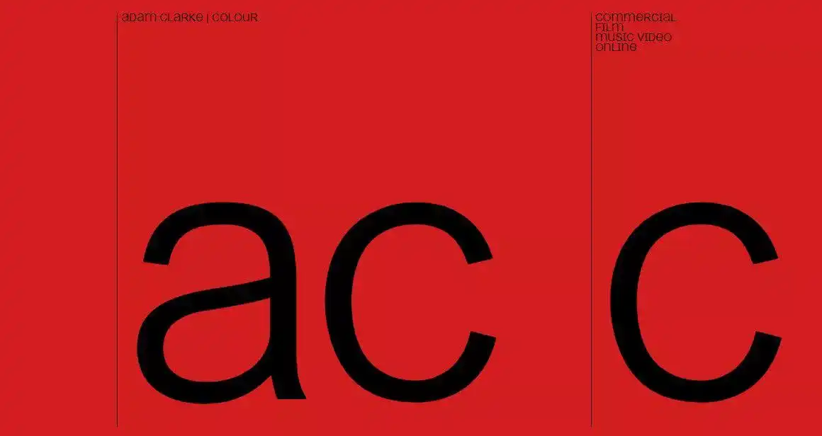
Adam Clarke | Color Homepage | Image Source
It is an innovative decade for designers, and you can expect a lot of web designs making headlines and turning heads.
As creative hats curate designs, the holy grail of every website—usability—must be kept at the top of all features. As Rand Fishkin, former CEO of Moz says, “I wouldn’t trust the content EVEN if it were great, because the UX is so rough.”
You can start tailoring to specific design needs and get ready to create winning designs for users—most importantly, enjoy the process of creation. Start crafting a captivating digital journey for users, and remember to stay in tune with modern web design trends and techniques, which will help you put your best design foot forward.
Top Design Skills to Stay Relevant
With plenty of modern web design trends and styles created, designers need to learn niche skills to stay relevant in their design fields. The key is to keep learning to remain competitive.
To understand the design community and critical design skills that one needs to acquire to stay relevant—here’s a sneak peek.
According to Dribble Global Design Survey, designers in the next 2-3 years will need critical design skills, such as motion design, business, communication, and illustration, to stay relevant.
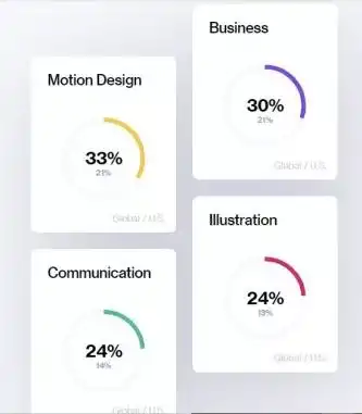
Design Skills to Stay Relevant | Image Source
Keep learning, creating, and having fun—that will be the mantra for successful web designs in 2025 and beyond.
Create Stunning Web Designs with Imaginovation
You want to incorporate the trending web designs and create a meaningful digital journey for your users—that’s great.
Get ready to create stunning web designs with the expertise at Imaginovation. We have helped many entrepreneurs, startups, and enterprise businesses to build stunning websites and apps.
If you want to turn your websites or apps into a valuable digital journey, get in touch with us.


