Get a personalized assessment of your operational efficiency and accelerate growth for your business.
User Interface (UI) designing is a balancing act – balancing between creating innovative ways of user engagement and also taking care of their needs.
The core function of the user interface (UI) to keep the users engaged with the digital product remains unchanged year after year. However, the products, the tech behind them, and the user behavior & expectations advance rapidly.
That’s why UI/UX designers need to keep pace with what’s happening around them and continue to look for ways to enable easy and pleasant user experiences across interfaces.
What UI design trends will dominate 2025? What styles and techniques should you adopt? What can it do for your digital products?
Let's find an answer to these questions and build digital products that are modern and trendy!
How UI Design is Changing in 2025
In 2025 UI design has become more critical than ever.
With newer technologies, we will see innovation in UI design much more than in the last few years.
UI Design in 2025 focuses on
- Improving user comfort and ease.
- Setting your brand apart from the competitors.
- Making your brand appealing.
This year, many UI elements offer their better and improved versions, from adding storytelling with scroll-triggered animations to retro-styled UI, Bolder, and wilder typography to dark mode.
In 2025, mixed reality, virtual workplaces, and foldable devices will offer UI design innovation.
Top 7 UI Design Trends to Watch Out for in 2025
As UX and UI design keeps evolving year after year, we see many new trends. Some become a rage, some are outdated soon, yet others evolve into something new.
As a UI/UX professional, you must stay informed about these trends and avoid designing an outdated product experience.
Moreover, with the constant shift in user behavior, you must look for trends that facilitate unique and engaging UI design.
It is essential to keep an eye on what’s trending to bring freshness to your user interface.
Here’s a list of the top seven UI design trends in 2025 to help you stay ahead of the product designing game.
1. Dark Mode
The dark mode is a low-light UI (user interface) that uses dark colors like black or grey as the primary background color of a web product. It reverses the popular white UI that designers have been using for years.
Designers prefer this trend because the look created with the dark mode is very modern, sleek, elegant, and mesmerizing.
But using dark mode in UI design is not as new as you may think. Many UI designers are already using the dark method on their digital products. In addition, big brands such as WhatsApp, Instagram, Google, and Apple have already adopted dark mode UI to enhance the design aesthetics of their websites and apps.
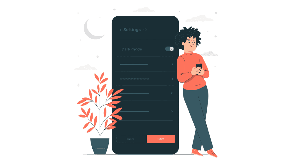
2025 is set to witness a rise in this trend. And, the reason is not only because it’s fancy and has an aesthetic appeal. But, in addition to the aesthetics, it enhances the user experience.
Apps designed in dark mode emit less light and reduce overall eye strain and screen glare. They are a suitable choice for users as they are easy on their eyes.
Moreover, when your product is text-heavy, dark mode increases your user’s focus.
While maintaining the readability and functionality of the product, designers must confidently and boldly adopt this trend going beyond just black or grey.
2. Voice-activated UI
The voice-activated user interface is yet another trend that will dominate UI design in 2025.
Living in an age of Alexa and Siri, where voice commands play an essential role, voice-activated UI is here to stay.
It offers an interface for the users to interact with speech or voice commands, thus eliminating the need to type.
Its popularity is seen in the numbers – Statista reports that by 2025, the number of digital voice assistants will reach a whopping 8.4 billion units – a number more significant than the global population.
Interestingly, users worldwide embrace this trend with open arms because it presents a viable option for people with accessibility issues.
Besides, since SEO (search engine optimization) has started exploring voice-based queries, voice-activated UI is what more and more businesses will look up to.
With constant technology advancements, limitations in word recognition accuracy are diminishing, and its adoption in UI design is increasing.
3. Minimalism
Minimalism is often discussed in all spheres of work and life, and design is not an exception. Designers adopt this approach to bring clarity, simplicity, sophistication, and elegance to the UI.
Talking from the perspective of UI, minimalism is expressed as a clean and simple design without extra frills.
2025 will see user interfaces that are both simple and stylish without being empty or overloaded.
You can include minimalism with the help of the following features that most businesses will love.
- Eliminating all non-functional elements
- Simplicity and clarity
- A lot of spare space
- Focus on proportion and composition
- Typography as an essential design element
- Grid layout
- And many more
4. Advanced Micro-Interactions
When it comes to the success of a product, small, little, tiny things make a big difference. In UI design, micro-interactions are those little details.
Micro-interaction is an exciting trend that makes tiny moments of user interaction with an app’s interface.
Designers worldwide agree that micro-interactions contribute positively to the look and feel of a digital product. Therefore, they have started using them to increase user engagement while providing users with context and system feedback.
You can use micro-interactions to communicate the state of a specific UI component.
For example, on Twitter, users can express that they like a tweet by clicking a heart-shaped icon in the tweet’s contextual actions.
Here, the micro-interaction uses a pumping-heart animation to convey that the user has liked something. This action can be reversed by clicking again on the same heart icon, changing the bright-colored heart back to its original grey state.
Micro-interactions are also great at notifying errors, for example, in the case of an interface that triggers a visual shaking micro-interaction on receiving incorrect info. It is considered a great help as it draws attention and notifies the user that data is invalid and prompts them to continue interacting with the form.
Adding micro-interactions thus becomes a significant UI design trend of 2025 that will keep your users hooked and make a difference.
5. Scrollytelling
Gone are the days of endless scrolling – Most of us find it boring.
We need a form of narrative that adds a little spice to our digital product. And this is precisely where Scrollytelling comes into play.
Scrollytelling is all about storytelling through scrolling. It is a UI design trend that helps you create a narrative with the help of illustrations, fonts, or text snippets, that unfold with every scroll.
As the user scrolls in, a new animation pops up or a new graphic appears that keeps the user hooked on to your app.
It is an engaging way to transform large-sized content into interactive stories and make your users stay on your webpage.
There are no clicks, no hassle of choosing, and no pop-ups – users can activate scroll telling as they scroll down.
6. Neumorphism
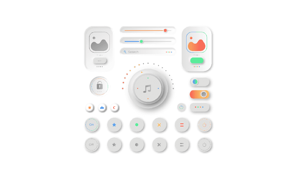
Neumorphism falls somewhere in-between skeuomorphism and other popular designs such as flat design.
This trend is gaining popularity because of the subtle yet innovative look it creates for apps and websites.
You place the user interface (UI) elements behind the background in this design – similar to the watermark setting. As soon as the user selects that element, it protrudes out and looks like it is coming out of the screen.
With this trend, designers create an interface with a wow factor without any flashy elements.
In neumorphism, it’s all about keeping the background and UI elements' colors the same and using shadow and light.
7. Big & Experimental Typography
Typography is an essential element in UI.
It includes all the text-based elements within a digital product, such as titles, subtitles, body text, captions, menu text, etc.
2025 is a significant year for typography because this is a year of experimentation.
More significant, bolder, wilder fonts — even serifs — are everywhere. They can quickly grab the user's attention, and they look super.
Designers have started using it because such typography stands out from its surroundings and demands to be read. You need to be careful about the overall aesthetic.
The landing pages of Dropbox and Samsung are great examples of bold typography usage.
When playing with this UI trend, consider how the typefaces will respond on different devices and how to maximize their impact on visitors. Besides, some experimental typefaces aren't just designed with flair; they also include animations.
The year 2025 has come with some notable UI design trends that can help you build brilliant digital products.
Create Stunning UI UX Design with Imaginovation
Great UI/UX design, they say, can separate great apps and websites from merely good ones.
Since 2025 brings some exciting and captivating new UI/UX design trends to improve users' fun, usability, and overall experience, there’s no reason you shouldn’t put them to use.
If you want to know how to create great UI designs, merge these UI elements into existing projects, or as a part of a brand-new digital product, get in touch with us at Imaginovation.
We will help you build some stunning UI/UX designs for your digital products.
Imaginovation is an award-winning web and mobile app development company with vast experience crafting remarkable digital success stories for diverse companies. Let's talk.


