
Jun 5, 2025
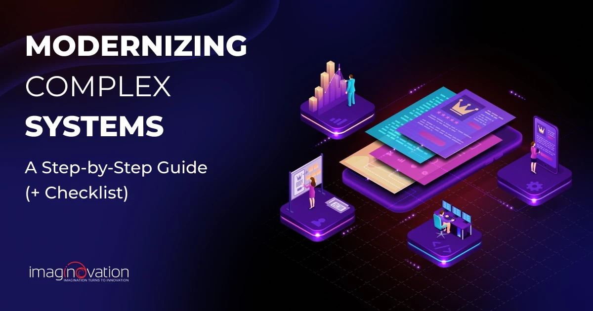
Modernizing Complex Systems: Checklist for Selecting A Reliable Vendor
Modernization is full of promise and risk, especially when it comes to enterprise systems. McKinsey reports that nearly 70% of…
Jun 5, 2025
Modernization is full of promise and risk, especially when it comes to enterprise systems. McKinsey reports that nearly 70% of…
May 29, 2025
You’ve built a fitness app that looks good and works well. It gets people excited in the beginning. But after a few weeks, user activity…
May 22, 2025
If your mobile app is lagging in performance, frustrating users, or slipping behind the competition, it's a clear sign that something needs…
May 15, 2025
Despite the rapid digitization of healthcare, one critical challenge remains unresolved: patient data is still profoundly fragmented…
Use our project cost calculator tool to receive a rough estimate on your project.
Apr 30, 2025
Have you ever stopped to ask how much revenue your app might be quietly losing to poor UX? Behind every clunky flow or buried button, there…
Apr 30, 2025
I recommend our clients use APIs all the time, and for good reason. APIs make it easy to add features like geolocation, identity…
Apr 28, 2025
Modernizing your business operations starts with one big decision: cloud or on-premise? It’s not just a technical decision. It can shape how…
Apr 21, 2025
Gamification in education is gaining traction — and it’s easy to see why. Super Mario Bros, Pokémon Go, Clash of Clans, Candy Crush — the…
Book a meeting with one of our team members and we will help you plan out your next steps. You can also use our calculator tool to receive a rough estimate on your project.
Apr 16, 2025
Many startups fail because they don’t achieve Product-Market Fit (PMF). In fact, 35% fail due to poor PMF, second only to running out of…
Apr 9, 2025
You already know automation isn’t just about saving time. It’s about making your operations more efficient, scalable, and resilient as your…
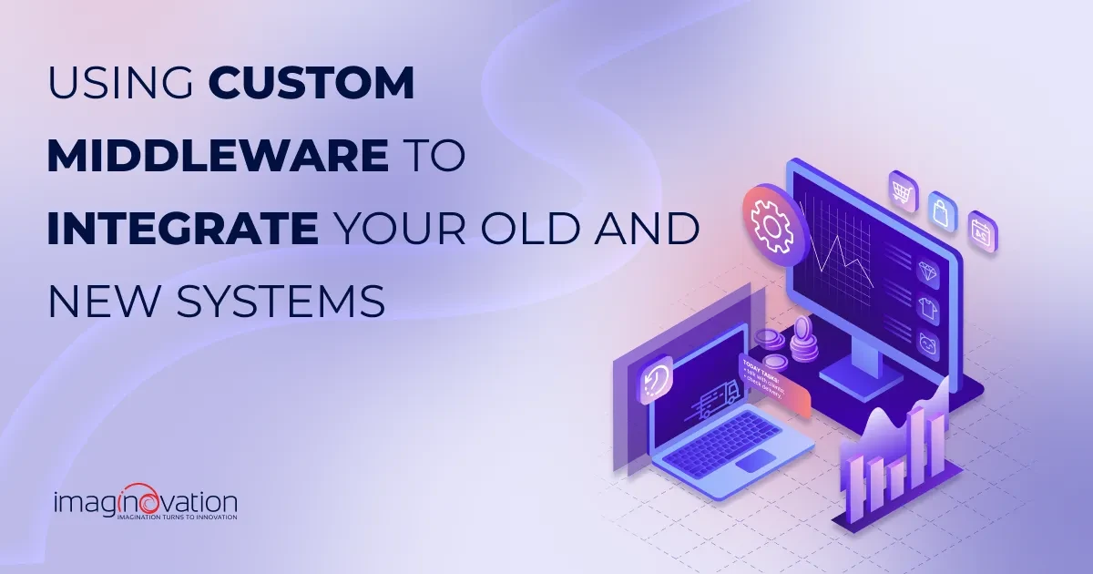
Apr 2, 2025
Your legacy systems might still be getting the job done, but let’s be honest: are they really keeping pace with modern demands? Are they…