To estimate the cost of building a website or an app, use our app cost calculator tool.
The mobile app industry is growing at an unprecedented rate. There are currently over 4 million apps available on the Google Play Store and over 2 million on the App Store.
This number is only going to increase in the coming years. With so many apps available, making sure your app stands out from the rest is essential.
This blog post will explore best practices for designing an app. We will also look at some examples of apps already using these practices.
Designing a Mobile App: The Essentials
Before we start with the best practices and most important elements of creating and designing an app, let's get the essentials out of the way. These are the basic design elements you need to consider before working on it.
- Competitor research. What other apps are out there that serve a similar purpose?
- Choose the right platform. Will you be developing for iOS, Android, or both?
- Wireframe. Create an essential visual representation of how you want your app to look and function.
- Find the right team. This is perhaps the most significant step in the process. Make sure you find a team that you can trust to build a high-quality product.
- Measure your success. Be ready to track your app’s download numbers, user engagement, and other key metrics to gauge its success.
- Always be iterating. Your app is never “finished.” As user needs and demands change, you should always be working on ways to improve your app.
Getting things right is vital. There is some serious money in mobile app development, where just in 2021, there were 230 billion global app downloads. It boggles the mind when one thinks of these numbers.
When it comes to developing an app, there are specific mobile app design best practices that should be followed to create a successful and high-quality product.
Also Read: How Long Should It Really Take to Develop Your Mobile App?
What Are the Best Practices for Creating a Mobile App?
Now we’ve handled the basics and the essentials. But let's dive into the best practices you can apply to create an excellent mobile app.
1. Make Use Of Gestures
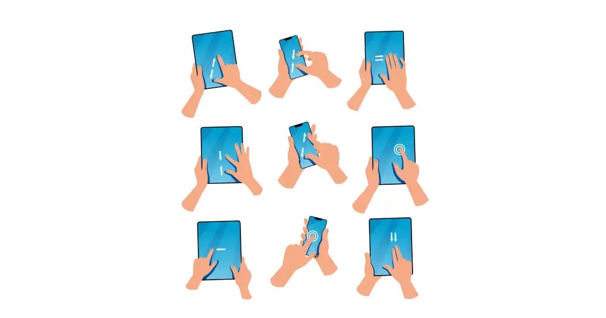
One of the best ways to take advantage of mobile devices’ capabilities is to use gestures in your app design. Gestures are a natural and intuitive way for users to interact with content on small screens and can help you create a more user-friendly and engaging experience.
There are a few things to keep in mind when incorporating gestures into your app design:
- Make sure the gestures you use are common and easy to understand. Users should be able to figure out how to use them without overthinking them.
- Use gestural navigation sparingly. Too many gestures can be confusing and overwhelming for users. Stick to a few basic gestures that will be most useful for your app.
- Use feedback to let users know when a gesture is recognized. This can be simple as a change in the cursor or a short animation.
- Test your gestures with real users to ensure they work as intended. There’s nothing worse than an unusable gesture!
Some common gestures used in mobile app design include:
- Pinching: Used to zoom in or out of a photo or map.
- Swiping: Used to scroll through a list or move between screens.
- Tapping: Used to select an option or open a link.
- Finger movement: Used to scroll through a web page or document.
When designing your app, consider which gestures will make the most sense for your users. For example, if you're designing an app for viewing photos. However, scroll gestures would be more appropriate if you create an app for reading news articles.
Also Read: Why Choosing A DIY Mobile App Builder is a Bad Option?
2. Be Mindful of Notifications
Notifications can be a great way to keep users updated on your app's latest news, updates, or features. However, too many notifications can quickly become overwhelming and cause users to disable them altogether.
The best practice for mobile app design will be to send notifications sparingly and only when they are genuinely relevant to the user.
When designing your app, consider how and when you will send notifications. Please make sure they are clear and concise and provide value to the user. For example, a push notification might inform users about a new feature or update or remind them of an upcoming event.
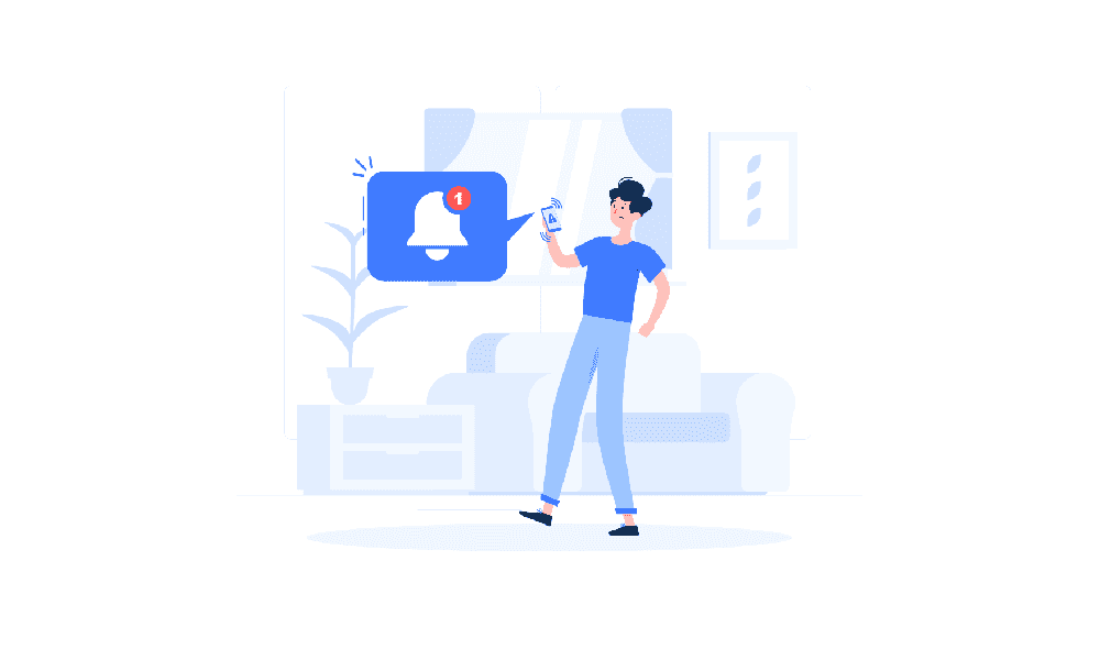
Some examples of push notifications that could be used in an app include:
- A notification about a new feature or update
- A notification reminding the user of an upcoming event
- A notification with information about a sale or promotion
- A notification letting the user know they have a message or voicemail
One example of an app that uses notifications well is Facebook.
Facebook sends push notifications about updates to the News Feed, new messages, and friend requests, among other things. The notifications are clear and concise and provide value to the user.
3. Maintain Component and Design Consistency
When it comes to mobile app design, consistency is vital. Your users should be able to navigate your app quickly and know where they are within the app at all times. To achieve this, you must maintain a consistent design throughout your app.
Use the same color scheme, typography, and iconography throughout your app. And make sure that your buttons, controls, and other UI design elements are consistently placed on the screen.
Some great examples of apps that maintain design consistency are Google apps.
All of the Google apps use the same and adhere to the above points. The buttons and controls are placed in the exact locations on the screen across all apps.
4. Using Negative Space
As a designer, one of the most important things you can do is to create a feeling of space in your design. This can be done with something as simple as the use of white space or negative space.
Negative space is the area around and between the subjects in your design. It is sometimes referred to as "breathing space" because it allows the eye to rest between elements.
When used correctly, negative space can create a feeling of balance and harmony in your design. It can also draw attention to some aspects of your design.
Google, Amazon, and Expedia apps are great examples of mobile apps that use negative space well.
In each of these apps, the negative space creates a feeling of calm and order. It helps to focus attention on the main elements of the design, and it doesn't feel cluttered or overwhelming.
5. Simplify Onboarding
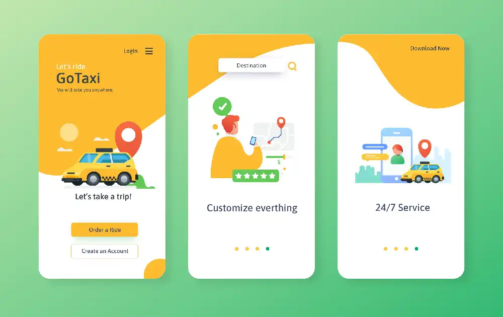
The first few minutes after a user downloads your app are crucial. If you can't quickly and easily guide them through the onboarding process, you will likely lose their interest (and business).
That's why it's essential to simplify your app's onboarding flow as much as possible. Reduce the number of steps required to start, and make sure each step is clear and concise. Use visuals sparingly - too many pictures or videos can be overwhelming.
Some apps that do a great job of simplifying onboarding are Facebook and Google Maps. Both apps walk you through the process step-by-step and use clear visuals to make it easy to understand what's going on.
In addition to providing directions and updates on traffic, Google Maps also sends notifications about nearby attractions, restaurants, and other points of interest.
6. Focus on Content-First Design
Your app's content is more important than its design. If your users can't find what they're looking for or don't understand how to use your app, they won't stick around for long.
That's why it's essential to focus on content-first design. Start by creating a wireframe of your app's layout, then add the text and images later. This will help you ensure that your content is accurately represented and easy to find.
Two examples of content-first design include the Netflix app and the Uber app. Both of these apps are easy to use and have clear navigation structures. Their layouts are simple and uncluttered, making it easy for users to find what they're looking for.
7. Keep an Eye On UI Noise
It's important to remember that, when designing for mobile, every element on the screen competes for the user's attention. This can easily lead to what's known as "noise" in the UI — too much going on, making it hard for users to focus on what they need to do.
There are a few ways to reduce noise in your UI design:
- Use fewer colors
- Use simple, clean shapes
- Use typography judiciously
- Use animations sparingly
One great example of an app that uses a minimalist UI is the weather app AccuWeather. As you can see in the screenshot below, the app uses a clean white background with black text and simple icons. This makes the information easy to read and navigate.
8. Optimize Your App for Poor Connectivity
Mobile app users often have to contend with poor connectivity in the developing world. This can mean anything from patchy 5G coverage to regularly interrupted service. Designing your app with this in mind is essential if you want it to be used by people in these areas.
There are a few things you can do to optimize your app for poor connectivity:
- Use small file sizes wherever possible. This includes things like images, videos, and audio files.
- Use caching to store data locally on the device so it can be accessed offline.
- Use data compression to reduce the amount of data that needs to be transferred over the network.
- Use asynchronous requests
- Make sure your app can work in offline mode
- Test your app in areas with poor connectivity
9. Optimize User Flow
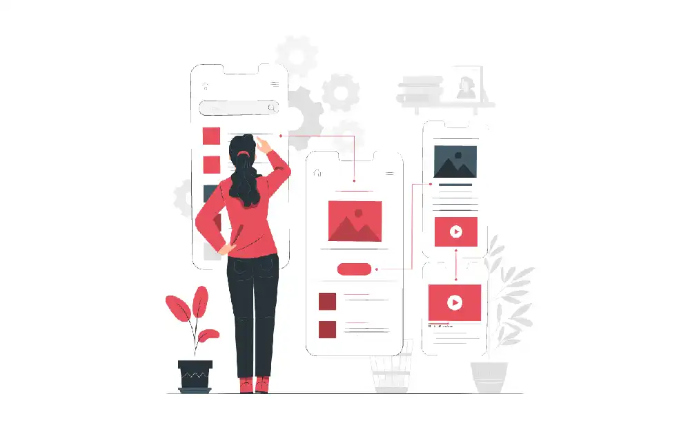
Optimizing user flow is one of the most important things to consider when designing your app. User flow refers to a user’s path when using your app. You want to ensure the user flow is as smooth and intuitive as possible.
One way to optimize user flow is to design your app so that users can complete their desired actions with as few steps as possible. For example, if your app allows users to book appointments, you would want to design the app so that they can do so with just a few taps.
Another way to optimize user flow is to use visual cues to guide users through your app. For example, you can use arrows or other visual design elements to show users where they need to go next.
Some apps that successfully optimized user flow include the Uber and Airbnb apps. Both apps are user-friendly and allow users to complete their desired actions with minimal steps. Additionally, both apps use visual cues to guide users through the app.
10. One Hand-Centered Design
Many prefer using their phones with one hand or at least having the option. This has significant implications for app design.
For one, designers need to be aware that users may not be able to reach all areas of the screen with their thumb. As a result, it's essential to place the most important buttons and links within easy reach.
In addition, designers must consider that users may have a more complex time scrolling and navigating through content-heavy pages. To mitigate this, designers can use buttons and links that allow users to quickly jump to the information they're looking for.
For example, Instagram has used a centered design in its mobile app and web interface. On the app, the main buttons are placed within easy thumb's reach, while the web interface uses a similar layout with buttons that allow users to quickly jump to the content they're interested in.
Also Read: What is Human-Centered Design and Why Does Your SaaS Product Need It?
Create A Modern & Powerful Mobile App Design with Imaginovation
Mobile app design is constantly evolving, and it can be challenging to keep up with the latest trends and best practices. However, Imaginovation can help you build some stunning UI/UX designs for your digital products.
We are an award-winning app design and development company with vast experience in developing stellar user experiences and exceptional digital solutions. We have helped many businesses and appreneurs turn their app ideas into a digital reality.


