Get a personalized assessment of your operational efficiency and accelerate growth for your business.
First introductions are essential – they can make or break the first impression. And, it is especially true for mobile app onboarding.
“You never get a second chance to make a great first impression.”- Will Rogers.
In the world of mobile apps, where users are unpredictable and distracted, it’s quite challenging to make lasting impressions. If you simply launch an app without giving much consideration to user onboarding, you lose a chance of grabbing the user’s attention from the start.
Therefore, the app onboarding process is considered to be one of the most crucial steps in creating delightful user experiences.
But, what is mobile app onboarding and how to do it right?
In this blog, we explain some proven onboarding strategies that will help you enhance user engagement and retention.
Let’s start.
What is App Onboarding?
Mobile app onboarding is the first point of contact a user has with your app.
It is the most critical phase in the user’s experience of your app because it determines a user’s journey from a first-time user to a full-time user.
Basically, it is the process of getting new users to enhance their engagement with your app enough for them to keep using it (retention) instead of dumping it after the first use.
Why is App Onboarding Important?
With millions of apps available in today’s massive mobile apps ecosystem, businesses try to make sense of how their app can stay ahead of the competitors.
An effective and engaging app onboarding process can be critical in this situation as it helps set the tone of your app and builds on the user’s interest.
Let us understand what kind of impact app onboarding can have on your app’s success and why it is crucial.
1. It Helps users see your app’s value.
Did you know 25% of app users abandon an app after only a single-use?
While the reasons why a user downloads an app, use it just once, and then promptly dumps it may differ, it takes you to an important question – Did the user notice the value of your app?
Well, this doesn’t mean there is no value in your app. It just means perhaps your app couldn’t summarize what the app will offer and how it is beneficial for the user.
A good app onboarding can give your users clarity of what to expect in the app, making them excited to start.
2. Gives your app a competitive edge.
Your app faces a huge competition to be one amongst 6.36 million apps. There are about 3.14 million apps in Google Play, 2.09 million apps in the App Store, and 1.13 million apps in other app stores. 218 billion apps downloads happened in 2020 alone.
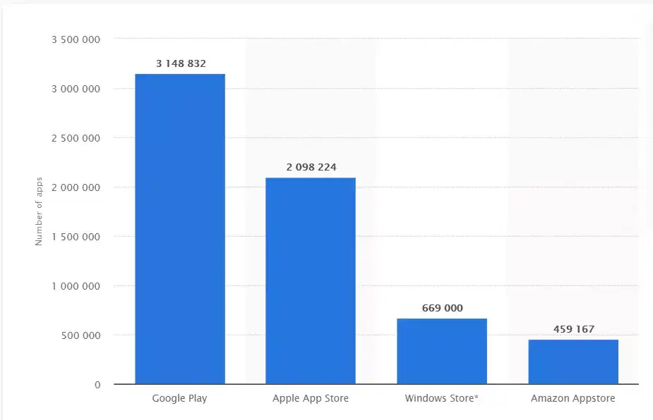
As you can see, the app market is quite saturated. In this scenario, where the competition is enormous, business apps cannot expect to survive without a lasting impression.
Great onboarding can help you convey your app’s value to users and give you a better chance to win them over.
3. Helps improve the retention rate.
Did you know 71% of app users across industries churn within 90 days?
App onboarding can boost retention rates by up to 50%. If the users understand what’s in it for them, they will not abandon the app.
Also Read: How to Engage and Retain App Users? 10 Key Strategies
Types of App Onboarding
If the users do not understand your app, they will not bother to use it.
You can engage your users better by selecting the most suitable onboarding type for your app.
Let’s explore all of them:
1. Benefits-Oriented Onboarding
Benefits-oriented onboarding focuses on conveying your app’s benefits and the value it can provide to its users.
This approach works best when the end-objective of onboarding is to boost your app’s conversion rate and motivate more people to use your app.
With this onboarding type, you can focus on describing what your app does without getting into the details of how to use it.
When you tell your users why they need this app and what value it brings to them, instead of telling them how it works, they’ll be encouraged to keep using it.
2. Function-Oriented Onboarding
Function-oriented onboarding focuses on showing users how to execute the standard functions of your app. It follows an instruction-based approach by including a demo video that shows how the app’s UI will function before moving on to the next step.
This approach helps clear up any confusion new users may face regarding your app’s features and functionality.
3. Progressive Onboarding
Progressive onboarding is one of the most fundamental ways to onboard new users. New information is shared with users as they navigate through various steps of your app.
The best thing about this onboarding approach is that it is direct and encourages users to take action.
4. Account Setup Onboarding
The account setup onboarding approach focuses on getting new users to register and set up their accounts before using your app.
It works best for social media or messaging apps that require users to make an account if they want to access app features.
You can consider building a walk-through of a simple account setup process.
The key is not to ask your new users for a lot of effort as it can frustrate them and put them off.
Keep the process of account setup onboarding as simple and easy as possible.
Mobile Onboarding: 10 Best Practices & Examples
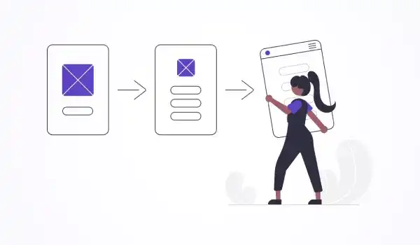
App designers everywhere dread app abandonment. It’s a genuine fear — app users everywhere are quick to download apps and delete them immediately if interest is lost.
So how can you stop app abandonment and help users stay engaged with your app?
There is no one-size-fits-all onboarding practice, but here are some common onboarding practices and examples to inspire you.
1. Build a tailored onboarding plan.
It simply means you must treat your app onboarding as another crucial element in your user experience.
Just the way you carry out extensive research on who your users are and then create an entire design around the user’s thought process and personas, you must also create a customized onboarding experience.
Interact with users. You can consider requesting user data so that you can customize your user’s experience.
Give your user choices – find out who they are. Consider different things about your users – what age group they belong to? Are they young and tech-savvy? Are they already familiar with the main functions of the app? This will help you understand what benefits your users will get.
Based on user choices, guide them through a simple onboarding experience that’s customized to their specific intent and requirement.
Make your onboarding hyper-relevant.
For example, the Fitplan app takes a new user through an onboarding process to select the best Fitplan for them.
2. Emphasize your app’s value proposition
Do you focus on telling your users about the app’s feature or on the app’s benefits?
If you are the user, would you rather have someone talk to you about how the new app will add value to your personal or professional life, or you’ll feel happy to know about the features?
It’s common to think that showing off your app’s best features will help convert first-time visitors to users. While this is not completely incorrect, it’s more important to promote the value proposition.
Honestly, people do not care too much about the features – they care about what’s in store for them and what they can do with the features.
Always on board with the value of your app.
Take the example of GasBuddy, a mobile app that allows its users to compare gas prices while traveling. It informs the new users upfront that the app can be used to help fuel their journey by offering them real-time reviews.
3. Showcase competitive features and core functionalities
Highlighting the benefits and value your app offers is a way of incorporating app onboarding. Similarly, you can consider highlighting the core functionality and competitive features of your app.
It will give new users a crystal clear understanding of what your app offers. Besides, this approach showcases your app’s most competitive features, ones that your competitors may lack.
One of the most excellent examples of this approach is the music app TIDAL.
As a new user, when you open up the TIDAL app the first time, you are greeted with teasers of what’s inside. The screens that follow highlight the music app’s strongest features, including HI-FI audio quality and offline mode. The users are then encouraged to sign up (if they are first-time users) or login to explore these features themselves.
4. Only ask for the mandatory information.
When you create the signup process for your app, do not ask for any irrelevant information to the app. For example, if your app is for listening to music, asking the users for information about their monthly salary may not be necessary.
Only ask for relevant and the most crucial information.
As per a report, 60% of the users avoid installing an app or uninstall it once they feel the app asks for too much information that may be unnecessary.
Do not bombard them with excessive questions. Instead, make your questions as concise and precise as possible.
It will positively boost your app user engagement.
Tell your users exactly why you’re asking for information and access to specific data on their phones. Please make sure you explain how that information will help them get value out of your app.
5. Make your app’s onboarding screens compact.
Please do not force your users to swipe through many screens before they can get into your app. It is tiring.
You will be at risk of losing potential users if your onboarding process is tedious and lengthy.
People get overwhelmed with pages of instructions. They would prefer to abandon your app soon and substitute it with a competitor’s.
If your app’s functionality requires a detailed explanation, it is best to use the progressive onboarding approach. It will break it compactly into a step-by-step guide, making the process fast and less demanding.
For example, instead of a lot of text, use illustrations and screenshots to convey important messages. It will not seem too heavy for the new users.
Also, try introducing only a single feature on each screen. You can also try placing tutorials and gamify the entire user experience for enhancing user engagement.
The mobile app of Birchbox, a makeup company, uses onboarding to reach out to users without overwhelming them with text-heavy screens.
6. Keep signups simple.
Another primary reason for churn is a lengthy and complicated signup process. Remember, people do not want to fill out pages long-form to sign up for your app. They may be signing up while they’re riding a crowded subway or waiting for someone.
Make your signup process extremely simple, concise, and fast.
You can also consider allowing login using a third-party account. So, instead of creating a brand new account for your app, users can log in using their Twitter, Gmail, or Facebook credentials.
Not only do they provide a few click avenues for signing in, but they also build trust in the user’s mind.
WhatsApp automatically detects SMS to simplify phone verification. The users don’t have to leave the app and search through their messages for a verification code to enter. It makes onboarding quick, provides a friction-less new user experience, and makes sure users don’t get distracted by something outside WhatsApp while onboarding.
7. Add a request for permission.
It may seem like a simple matter, but it can still arouse strong feelings in users.
Many people don’t like apps bombarding them with requests to grant permissions, like push notifications, access camera, access contacts, or personal information like billing data. When it comes to onboarding, you have to be careful not to overstep.
Remember this when it comes to permissions, grants, or sensitive information. For example, many apps allow new users to signup and explore before asking for more information to complete their user profile.
It is precisely about postponing things that require more trust. Give the user some room to grow more familiar and comfortable with the app first.
Users are known to uninstall apps when they feel they’re at risk of security/privacy issues.
OfferUp app makes it easy to buy and sell used items by giving users an easy way to message potential buyers or sellers.
New users have to opt-in to necessary permissions that include camera access and message notifications. The app sets up a logical reason to opt-in to notifications and receives an alert when someone expresses interest in buying the user’s stuff.
8. Show progress
Users would not want to go on an endless application tour. Nobody likes to wait – wait for an onboarding tour to end.
The user’s Onboarding experience should be brief and to the point. Designate every step and show users the number of remaining steps and how far they have already gone.
Users tend to be excited to try something new for the first time and explore it in their own time. Onboarding cannot stretch on for too long — users won’t stay excited to go on an app tour that’s too long.
That’s why progress bars are needed. It’ll show your users their progress and how long the complete onboarding sequence is.
The Pocket app uses dots at the bottom of the onboarding screen to show progress.
9. Conclude with a CTA
Try to include a direct call-to-action towards the end of your onboarding experience. It’ll help the users have a direct next step to take. When you immediately involve the user in your app, it helps them continue to grow as engaged users.
So a well-designed CTA will make sure your user is engaged.
Cinch is an app that exemplifies this practice of adding CTA, telling users to “ask a question” after onboarding.
10. Offer the choice to opt-out.
What if some users want to opt-out of the entire app onboarding process?
Not everyone wants to be handheld and walked through the onboarding process. Tech-savvy users, in particular, may wish to skip it, dive right in, and explore the app themselves without sitting through the app’s tour.
You must give your user the option to choose whether they want to go through the process or exit.
The music video streaming app called Vevo discovered that adding a skip option to their onboarding flow has increased their logins by approximately 10%, and the number of successful sign-ups also jumped by around 6%.
Build An Intuitive Mobile Application with Imaginovation
Before you start designing your app’s onboarding approach, stop and think of what kind of experience you want for your app’s first-time users. Consider what you would like to accomplish and which onboarding techniques will be the most appropriate.
Remember, nobody starts using an app to learn how to master it, but rather to complete specific tasks efficiently.
Good onboarding, therefore, requires the right mix of teaching users to use your app and sell them on the benefits if offered.
Do you want to build a powerful app with high user-engagement and retention value? If yes, get in touch with us. We are an award-winning web and mobile app development company with vast experience in crafting successful digital experiences.
Let’s talk.


