Get a personalized assessment of your operational efficiency and accelerate growth for your business.
Software as a service (SaaS) products are, by nature, designed to be used by a large number of people.
However, some products are more popular than others.
What are the secret ingredients behind successful SaaS?
From robust backend programming to the platform’s purpose, there are many reasons for its success. But, one common ingredient in all successful SaaS products is a hit design philosophy.
Do you want to achieve the same winning design layout for your SaaS?
Then keep reading to learn about common challenges and some great tips on SaaS product design!
SaaS Design: An Overview
Many different types of solutions, such as customer resource management (CRM), enterprise resource planning (ERP), web hosting services, and eCommerce, use SaaS.
When it comes to delivering software, the SaaS model is a clear winner. It offers many benefits, including cloud storage, lower computing space requirements, cost flexibility, on-demand functionality, etc.
At the same time, some responsibilities also fall on the shoulders of SaaS providers, who must deliver improved user experience and accessible interfaces.
But first, let’s explore the SaaS industry.
SaaS business is booming. It has become a global phenomenon. It has grown by a massive 500% in the past seven years. (Source)
Even today, growing at a breakneck pace, the software-as-a-service market is expected to grow from 146 billion U.S. dollars in 2021 to 195 billion U.S. dollars in 2024. (Source)
Its rising popularity is further seen with the following statistics - Organizations with an average of 1,000 plus employees use more than 150 SaaS applications.
A SaaS application’s value is evident in its excellent design.
A good designer understands how to use visual (user interface) and structural (user experience) tools to convey the value of their solutions. As a result, they help you stand out from the competition, which positively impacts your marketing strategy.
And well-designed SaaS products dramatically impact user experience. The look and flow of your cloud solution are what users see when they interact with it.
According to another statistic, by 2025, 85 percent of the applications used will be SaaS-based.
To stand out from your competitors and ensure your SaaS product succeeds, you must do everything to make it unique. So the better your SaaS app design is, the more likely people will stay with your product.
Common Challenges with SaaS Design
Designing SaaS products can be a challenging task. That's because adding new features to your SaaS product can lead to added complexity and more moving parts to manage.
It's very easy, then, to lose sight of the core problems that the solution needs to solve, and instead, you get entangled in future ideas, unprioritized feedback, and other distractions.
That’s why a SaaS design project has to be extremely well executed.
Here are a few mistakes you must avoid in designing Software as Service products:
1. Over-emphasizing new features and low-priority feedback
SaaS businesses have to retain their customers as well as acquire new ones.
Product teams will feel anxious if their product quality drops and they lose customers. So businesses try to retain their customers by adding more features.
But this can be tricky because if those features are unnecessary, the SaaS product seems convoluted. On the other hand, customers also don't want to use a complex, difficult-to-use product.
You can address this issue by making minor improvements even if customers don't notice them instantly. The value proposition of a SaaS product can also be its price or user experience or how it solves a problem compared to its competitors.
Moreover, you can continuously evaluate user needs using various research methods such as price sensitivity surveys, competitor analysis, or usability research.
Another thing you can do is evaluate all stakeholder feedback and see if the concerns raised by them align with real user concerns.
You can then accordingly assign priority to the feedback. This keeps your SaaS products design lean.
2. Ignoring the importance of multiple-user access management
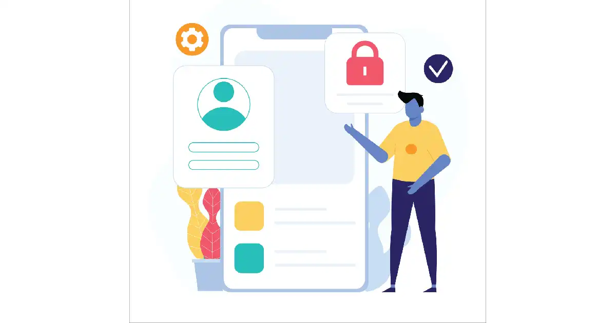
An essential aspect of a B2B SaaS product is that multiple users have varying access privileges, such as admin, manager, or associate. In such a case, a one-size-fits-all approach doesn't work.
Besides, users can be more productive when they only have access to the features and interfaces (menus) they need, not everything.
It is a common mistake many designers commit because different user roles have different goals.
Therefore, a design strategy that focuses on showing most of the product's functionality in one go isn't helpful as it brings down the user experience.
One of the solutions here is to provide users with a tailored experience by implementing role management. Customization can also go hand-in-hand with personalization - making the user experience relevant for a specific user.
This is a great way to help users carry out their tasks without tools meant for other user roles to get in their way.
3. Leaving users unassisted
What happens when an app user is frustrated and has a question?
The user then tries to find the 'support' link. And if they can't find it within the next few seconds, they get more frustrated with your product.
Many SaaS products are designed in a way that keeps their support resources hidden, and their websites need to be checked thoroughly to locate support.
Do not hide your support resources or, worse, contact channels. And there should be no excuses, as the solutions to fix the problem exist and are not difficult to implement.
Make your support contact form and other support resources accessible to users in a very visible area.
You should also design an engaging onboarding experience that helps users acquaint themselves with the product as quickly as possible. Walk users through the core product by letting them complete common tasks.
In addition, build a well-designed FAQ section for your users.
4. Failing to Maintain Efficient DesignOps Processes
DesignOps is an organization's framework for research, testing, and more.
An efficient DesignOps ensures that teams stick to best practices.
Organizations implement a design methodology such as design thinking or human-centered design because they offer clear frameworks for pushing projects forward at a steady pace.
In an ever-evolving design of SaaS products, an efficient DesignOps process helps you find the right methodology that works well for your team and your product.
5. Complex interface
The number of features and integrations in a SaaS product can quickly lead to a complex interface.
Designers need to strike a balance between sophistication and user-friendliness. The key is to design around the core features and add what’s essential.
It's crucial, therefore, to maintain a consistent interface across all devices. A complex interface that is not responsive is only going to frustrate users and cause them to abandon your app.
Users must be able to explore with ease right away. You can ensure this by organizing app info into categories, emphasizing the fundamentals, and allowing users to go further if required.
Also Read: How Do You Know If Your SaaS Application Concept will be Profitable?
Best Practices for Creating a Design for SaaS Products
Don't just create a product. Create an experience for your users.
Saas Design is all about delivering unique user experiences and making bold design choices.
Implement the following SaaS design best practices and make your product delightful.
1. Simplify signup
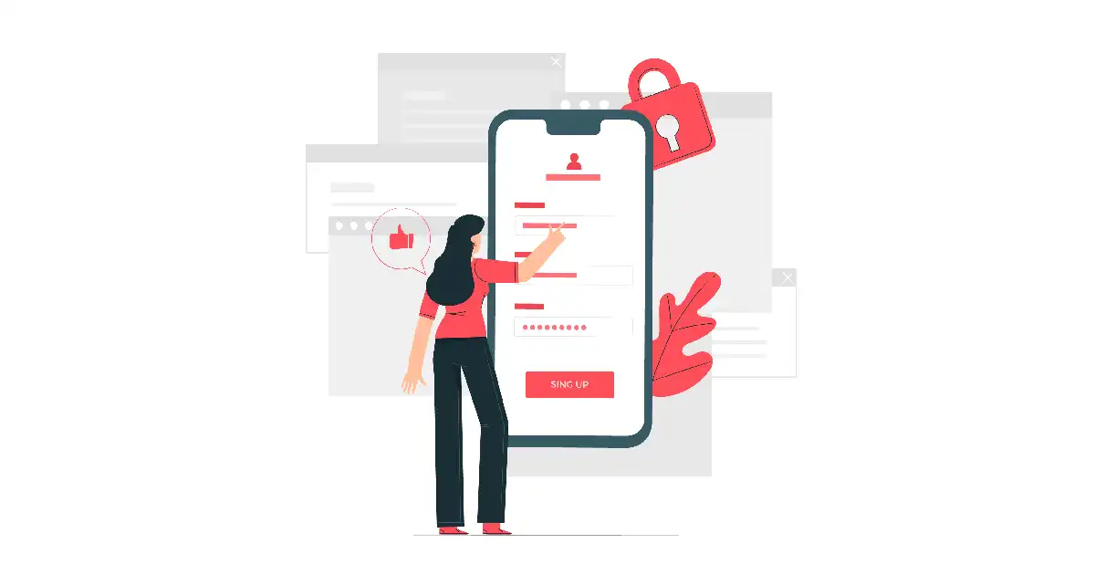
Your signup flow is your product's first impression on a new user. It is the first thing users will see in their user experience journey, so it's essential to get it right.
When a user signs up, they have decided to use your SaaS solution after weighing other options.
So, if you don't want to scare away your potential customers, the most critical SaaS design practice is to make the registration process as simple as possible.
This is how you can design a signup flow for your SaaS product:
- Start with just the basic information and then get more detailed as you go along.
- Therefore, gather only the most critical information (name and email address) during signup. This means don't make your users spend too much time filling in a lot of information.
- You can collect additional information only if required but try to keep it short.
- Get your users to the app UI as quickly as possible and eliminate all kinds of unnecessary steps.
- Designing a vivid call-to-action button is a great way to get more users involved in the signup process. It may also specify that registration is free for users if there is a free trial.
2. Build a dashboard to engage & inform
After logging in to your SaaS product, the dashboard can be a user's first impression.
So spend time on the user experience of your dashboard and lead to a greater return on investment.
A positive dashboard experience should offer a graphical view of performance indicators (KPIs) that each user needs to perform their role.
The ability to organize and present information from multiple sources in one location, ideally in real-time, can make your dashboard valuable.
Make sure:
- The dashboard is customized as per the individual user profile.
- You build a contextualized user experience.
- You display progress against targets for the current month, week, or any other specified period.
- You show important user metrics that indicate success and failure and the return on investment (ROI).
3. Self-serve onboarding experience
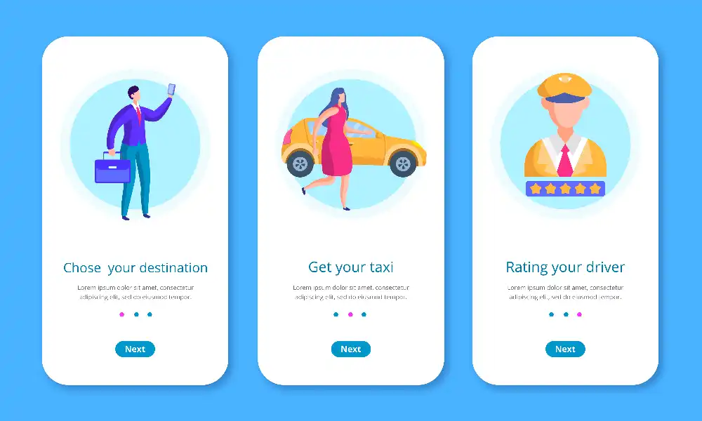
The onboarding process is a great way to welcome new users and show them the product's functionality and benefits. Keep your SaaS elements simple and clear to make it easy for users to find what they need.
The onboarding process for a SaaS varies from product to product.
For example, a complex SaaS may need more time to educate users about its features than an easy one.
Because the primary purpose of SaaS onboarding is to prompt users to activate your solution, make sure the process is highly user-friendly. In fact, the more complex your cloud app is, the more self-serve and simple the onboarding process should be.
Ensure the users understand your solution.
This is what you must include:
- Build an interactive walkthrough instead of a basic tour for your users on the Getting started page.
- Include tooltips to specify additional information as the users interact with your SaaS elements. This way, you can drive users' attention to the diverse functionality of your solution.
- Include video tutorials.
- Design an onboarding checklist along with a progress bar.
4. Personalization
Users like it when they feel as if a digital product was designed just for them. Personalization does just that - It aims to offer the best user experience.
What is personalization?
It is your product’s ability to provide experiences based on the features that users apply. To do this, you can collect customer data and use it to personalize your product.
Let your customers customize your app's UI by providing a set of options they can turn on or off. Of course, such options might depend on their pricing plan, but in any case, they'll get the most out of your SaaS by tailoring it to their needs.
Another interesting way to personalize your SaaS product is by filling in empty states.
An empty state is when your user signs up for the SaaS product and there is nothing to display. The vital aspect here is that an empty state should not be empty. It’s because this UX component makes it easy for you to acquire, onboard, and even convert users.
Moreover, empty states help customers to know and learn about your product. Letting users replace empty states with relevant information is a way of showing them the value of your product quickly. This approach reduces time to value.
5. Straightforward menu navigation & page hierarchy
You might believe that you've designed a top-notch SaaS product, but if your customers need help figuring out how to use it, they're not going to stick around.
Ensure that your navigation bar has only a few items on it and that you have different pagination layouts for additional information.
Here’s how you can improve the design of your navigation menu:
- First, ensure your navigation is easy to use by testing it on real people. You can do this by asking a group of people to try out the site/app and give you feedback on the arrangement of menu items and pages.
- Make sure your navigation is aligned so that users can reach their goals. Make it easy for users to find their way by including tooltips or short videos to guide them through the menu items.
- UX writing on a landing page should be clear and concise. It should outline the various elements of your solution, such as buttons, menus, error messages, and product instructions. It's important to give a seamless experience with your SaaS app, so microcopy plays a key role in retaining customers.
- Select navigation patterns for your SaaS product that align with its purpose. As a rule, horizontal navigation is considered the most intuitive pattern. If you need to include more items in the menu, use vertical navigation, allowing scrolling. Finally, if your SaaS platform embraces complex functionality, you can combine both types.
6. Make tactical call-to-action buttons.
CTA stands for call-to-action. It's a button or links you see on a website, ad, or email asking you to do something or buy something.
CTAs help users reach their goals quickly, complete tasks efficiently and reach their destination on time.
When customers use your SaaS app, ensure they understand what happens after specific actions.
Effective calls to action that convert visitors to customers are usually appropriately sized (i.e., big enough to be noticed), contrasting, and compelling.
7. Integrate AI-based chatbots

Chatbots are an integral part of our lives, whether we realize it or not. For example, we interact with chatbots whenever we use an online healthcare solution, a banking app, or a logistics service.
So it's no wonder the chatbots market is expected to reach 2.5 billion USD by 2028.
Chatbots powered by artificial intelligence will make your app more user-friendly. Users will be able to find the answers they're looking for without having to wait on hold with a human customer care executive.
Furthermore, using chatbots would enable you to hand over repetitive and routine tasks to the bots, allowing you to conduct real-time testing.
8. Client support
No matter how good or thoughtful your user experience is, there is always room for questions. A great way to address this is with a chatbot on your website or by sending informative emails to users.
FAQs should be written in a way that's easy to understand.
Try personalizing chatbots: GIFs, images, and text can help create a more dynamic experience for your users.
SaaS customer support is a powerful tool. It will help you get users' feedback, improve your product, and build client trust.
Also, it's a good idea to include an "About Us" page along with contact details. This way, users can learn more about the company and the people behind the SaaS product. Pictures of professionals working on software as a service appeal to them.
9. Continuous enhancement of SaaS design
As your user base grows, so will your product. Therefore, you'll need to keep evolving the design to fit the new scale.
Social media and surveys on your website will help you discover what works best for users.
So, you can align your design with their needs and ensure they stay happy with your app.
A good tip here is to send out an update notification when you make a change. This will let your customers know what's new and keep them using your app.
10. Right Colors and Themes
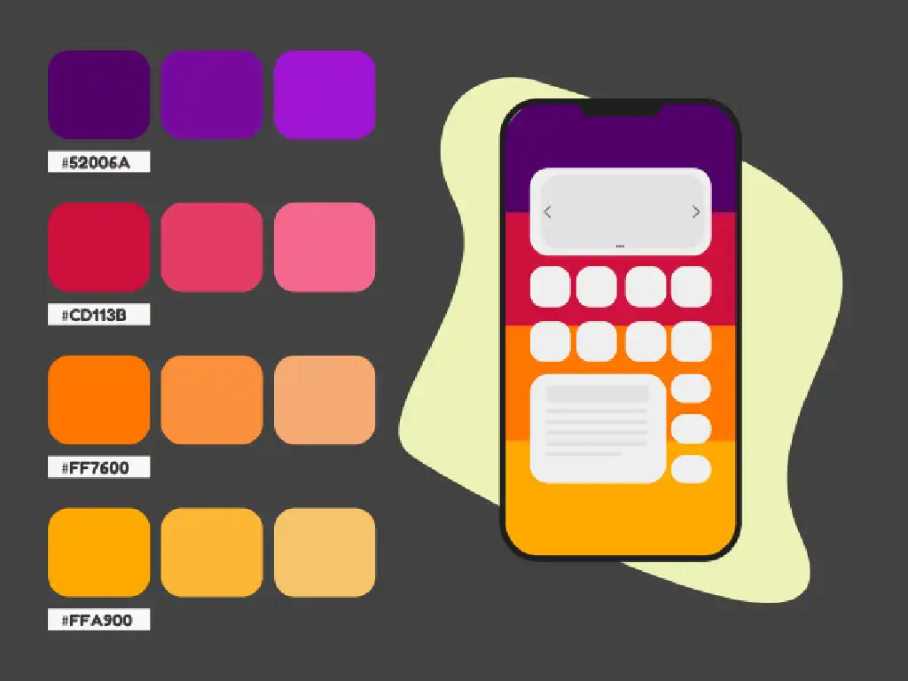
A good color palette can make or break a design, so knowing how to use one while designing SaaS digital interfaces is essential.
Even the best UI/UX specialists cannot create a SaaS design that equally pleases all users. But they can try to accommodate differences between users by offering them many customization options in terms of colors and themes.
Regarding fonts, don't be afraid to mix things up a bit.
Also, dark themes have become increasingly popular in recent years; however, color palettes should be used sparingly and always stay within the platform's branding.
To showcase a difference in a category, change the color saturation.
Create A Modern & Powerful SaaS Product Design with Imaginovation
With so many SaaS products looking the same, it’s crucial to include a creative solution in your pack of digital products. Designing a SaaS product that looks modern and yet unique will put you at the forefront of innovation.
SaaS product design can feel overwhelming; it's full of technical terms and methodologies. However, having a clear roadmap is the best way to maintain direction amid growing technical and product complexity.
Imaginovation can help you create a truly revolutionary and memorable SaaS product design. Our UI UX design services cover all the aspects of custom product design.
Imaginovation will deliver a modern, well-designed SaaS product that meets your business need exactly. We can build a SaaS product using cutting-edge technologies and best practices to create a top of line SaaS product design that is effective, scalable, and secure.
Imaginovation will help you find the best way to deliver your SaaS product.
Contact us if you need a design that will make your product stand out.
We'll be happy to bring your solution to success.
Imaginovation is an award-winning web and mobile app development company with vast experience crafting remarkable digital success stories for diverse companies. Let's talk.


